12 Fresh and Inspiring Flyer Design Ideas
Flyers are one of the most popular print marketing materials due to their versatility, size, and affordability. But if every other business in town is creating flyers, you ll definitely need to make yours unique! Get some inspiration for a creative and interesting flyer design in the tips below.
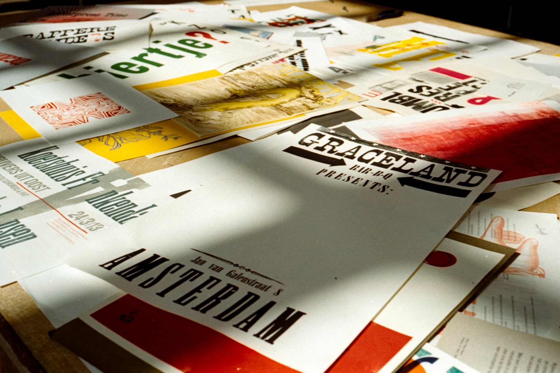
1. Select Great Imagery
This idea goes first because it s one that can work for any flyer in any industry. Whether you re creating a traditional flyer for your church or an artsy flyer for a local cultural festival, choosing the right imagery will set the tone instantly.
You could go with something literal like this image of a doctor for a medical flyer:

...Or you could choose something more like the image below, which has no connection to a doctor yet still helps convey how your child could feel with the care of the right doctor: happy and free.

For more tips, check out our guide to choosing the best images for your flyer design.
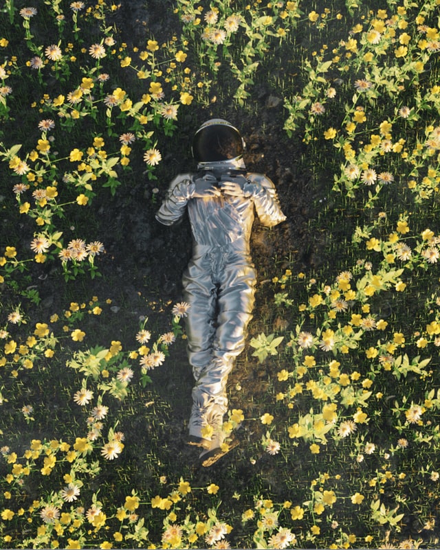
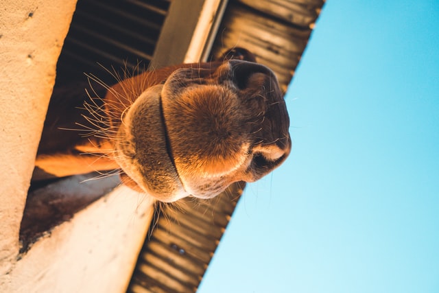
2. Be a Little Weird
Want to push the boundaries a bit and really make your flyer stand out? Then take that awesome imagery even further! Instead of choosing one of the beautiful but fairly standard-looking images above, seek out something a little different, maybe even a little weird.
This surrealist astronaut would be right at home in an artsy or futuristic music festival flyer.
This odd but adorable camel certainly has something to say and could make a statement on your business flyer!
Get some tips on where to find cool imagery (for free).
3. Add Some Flourish to the Pictures
In addition to choosing cool images to start with, consider adding some extra visual appeal by playing with their presentation on the flyer. Instead of just setting the picture there and leaving it as is, you could:
- Add a border
- Add something on top such as lines, a texture, an icon, etc.
- Adjust the transparency
- Rotate the image
- Stack several pictures
- Crop the picture at an interesting point
For instance, the narrow and subtle lines on the yoga flyer below make the image and overall layout more interesting. It almost looks like we re gazing out a window and picturing the amazing retreat we could be attending.
4. Play with Depth and Perspective
Most flyers are two-dimensional, but no one says they have to be!
If you have the budget, you could spring for a more complex flyer design that actually pops out into 3D space. (These flyers are definitely memorable but also tend to be more expensive as they require thicker cardstock and custom laser cutting.)
If you want the 3D look without paying a premium for actual pop-out flyers, consider layering elements and adding dramatic drop shadows to create a similar feel. The travel flyer below adds some simple depth by stacking polaroid-esque photos.
5. Supersize Your Text
The whole point of a flyer is to get a particular message across, and bold, eye-catching text is a fantastic way to do so. Shorten your headlines and then blow up your text so that it s the first thing anyone could possibly see.
Case in point you can t miss the main message of this open house flyer!
6. Try Out Other Text Treatments
Size isn t the only way to play with text. Try out different text treatments such as:
- Rotating text
- Adding line breaks in the middle of words
- Alternating the size, rotation, or position of individual letters
- Combining unique but complimentary fonts
- Putting text into interesting shapes
- Splitting a word into two different colors
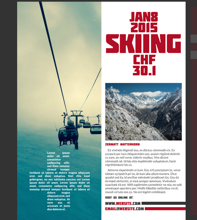
Notice how the text in this skiing flyer is designed to make the cross of the Swiss flag? So creative!
The music flyer below takes a more subtle approach but still adds plenty of visual interest by having the main headline rotated upward. Because it mirrors the neck of the guitar, the whole design looks cohesive.
7. Brighten It Up
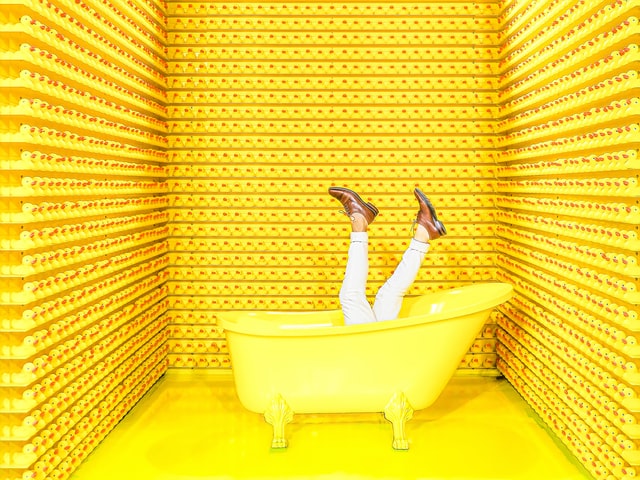
Choosing an unexpected or super-intense color is another way to make your flyer stand out. You could pick a single pop of vibrant color like the yellow of this photo...
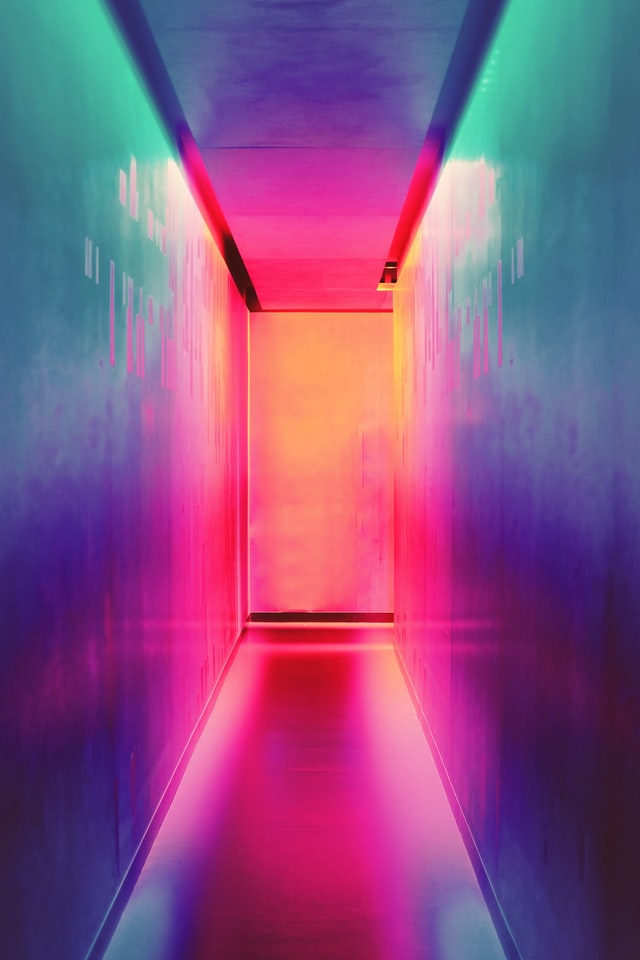
Or you could mix it up with something eye-catchingly rainbow.
Want to learn more about color? Check out some interesting tips on the psychology of color for print design!
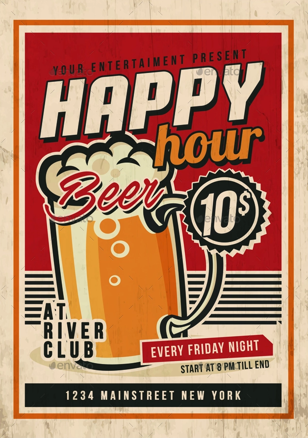
8. Do a Throwback
Does your target audience feel nostalgic for the good ole days? A retro approach to a flyer can help it stand out in a sea of modern designs and fortunately, retro can mean almost anything.
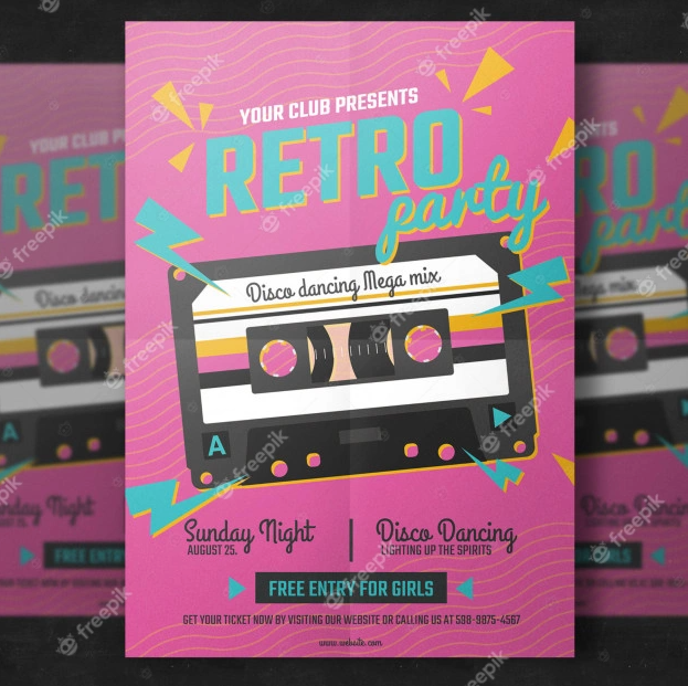
Here s a great example of a flyer with late 80s/early 90s flair.
Or this one is more traditionally vintage/Americana, fitting in perfectly for marketing a dive bar or a local restaurant flyer.
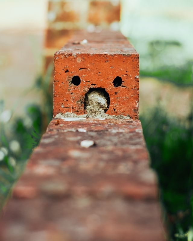
9. Feature Faces
People are instinctively drawn to faces and will almost always look first toward a face when presented a series of images. Take advantage of our natural human inclination by featuring imagery with people s faces front and center!
Political campaign flyers are a great time to feature your face, not only drawing attention but also building trust.
You could even put a fun twist on this idea by incorporating imagery of things that just look like faces. Since our brains are wired for facial recognition, we often see faces in everyday objects that don t have any!
The surprised brick below could make a delightful addition to a flyer, perhaps announcing a fun (and surprising!) flash sale.
10. Add Cool Patterns
Background patterns are an easy way to provide visual interest and make a flyer feel more professionally designed. This Mother s Day flyer uses a tropical botanical pattern to get mom excited about a rejuvenating day at the spa.
On the other hand, this bold flyer makes the pattern the main element.
11. Go Boldly Understated
I know... "Boldly understated sounds like a paradox, right? But the truth is, sometimes a flyer design can stand out specifically because of its minimal design. Less can definitely be more, especially if your flyer has to compete with many others (in a mailbox or at an event booth).
This layout looks elegant and maintains a light, airy quality. There s plenty of white space and room to breathe.
Whether for posters, business cards, or flyers, minimal designs tend to look refined and expensive. Find out how to create any design vibe with our beginner-friendly guide!
12. Design with Intent
The way that you place elements on the page can help draw the viewer s attention to the most important pieces of information. Think about what you want the viewer to see, and then place visual cues to lead the eye!
Notice how the triangle-shaped image cropping of this real estate flyer subtly points the eye downward. The viewer is naturally brought to the unmissable headline: PRICE DROP!
*******************************************************************
Want even more ideas and inspiration for your flyer design? Then start with our library of 4,000+ flyer templates! You can browse the entire list to get inspired, or use the category filters to start with a flyer template that fits your specific industry or need.
Just click on any template to start customizing it right away. Happy designing!