How to Make a Poster: Design and Branding 101
Master the art of impactful poster design and effective branding strategies.
Published Nov 1, 2018
 From the strapping and determined Rosie to the infamous, predatory shark from Jaws, posters have had a long history of spreading ideas, promoting events, and marketing products. Even though advertising is mostly digital these days, the printed poster remains a favorite for getting the message across. [caption id="attachment_3323" align="alignnone" width="700"]
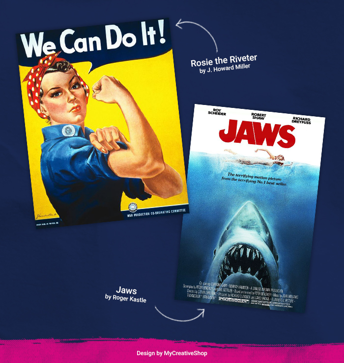 Rosie the Riveter by J. Howard Miller, 1942. | Jaws by Roger Kastel, 1974.[/caption] It doesn t matter if you re promoting a bake sale or building an awareness campaign for an emerging brand, starting the design process can be intimidating. It may seem like you need to be blessed by a muse for divine inspiration, but the success of poster-making is largely dependent on the work done pre-design. Strategic planning goes a long way and ultimately guarantees the strength of your communication. You don t have to be a professional to develop a good design. Beginners and professionals alike follow fundamental design principles. To help you design the poster of your dreams, we streamline the planning process and break down the dos and don ts of design to make the road to a successful poster a little bit easier.
 Start by defining your brand
You ve probably heard of branding. If you ve been on a subway train lately, you ve certainly seen it. Branding is the development of an identity to represent a product or a company. Once the identity is determined, it informs all the subsequent design choices from color to logo to tone of voice. At its core, branding is a way of thinking about your product and presenting it to the world in a unique, fitting, and memorable way. While it is an age-old concept, branding is having a heyday thanks to the prevalence of e-commerce shopping and the wide reaches of the world wide web. This mode of thinking isn t just for the latest sneaker company. The strategic use of branding can benefit anyone looking for an audience response whether it s the sale of a product, use of a service, attendance at an event, or vote in an election. [caption id="attachment_3301" align="alignnone" width="560"]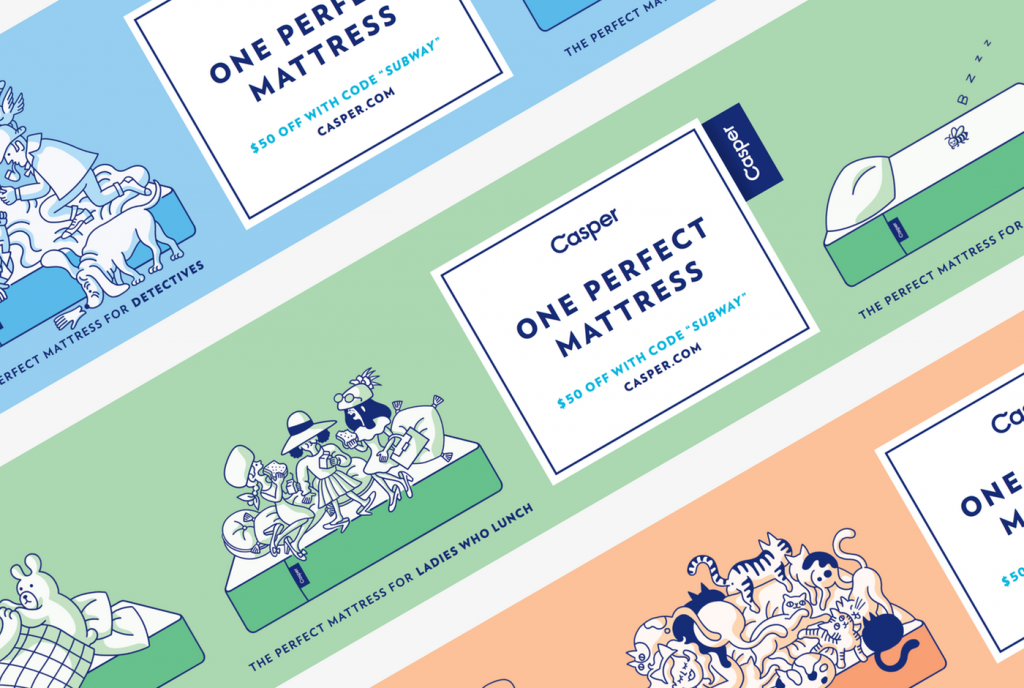 Casper, a mattress company, uses a distinguishable color palette, tone of voice, and playful illustrations to create a memorable brand.[/caption] Sure, there are professionals you can hire to do this, but you can also come to some similar conclusions by asking yourself the right questions. Don t discount the importance of this step. If you don t know your brand, you can t expect your customer to. It may be best to get out a pen and paper and work through the following questions. You may be asking yourself, Do I need to answer all of these just for a poster? However, locking down who you are as a brand is essential. We highly recommend it as it will ensure your product is shown in the best light possible. Think of it as an investment. Asking yourself these questions will not only benefit your poster design, but it will inform every design choice from here on out and will ultimately make your brand a more successful one.
 What are you trying to pitch?
Define your product.- What is it exactly?
- What s so special about it?
- Why should someone want it?
- Why should someone want it over another product?
- If you had to give an elevator pitch, what would you say?
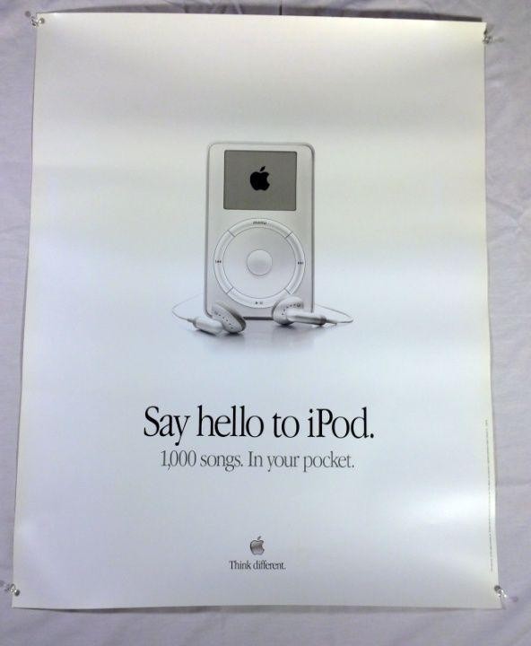 Does anyone do this better than Apple? Check out their simple messaging on this iPod poster from 2001. It's brilliant![/caption] Say you re promoting a music festival featuring contemporary electropop artists. While the electropop fest is a product in itself, what makes it special? Why should people be compelled to go to this show rather than one of a hundred other shows? Perhaps you re featuring artists that are up-and-coming and should be on your target audience s radar. Perhaps you re the only show in X-location to feature Y-artist. Perhaps it s smaller and more intimate than other shows like it. Regardless of what it might be, think of how your offering is different and how you can articulate that difference s value.
 Who are you trying to reach?
Next, pinpoint your target audience. Articulating and understanding your customer will help you decide how to best sell to them.- Who would be most drawn to your product?
- Who would be most likely to purchase it?
- What characteristics define this audience?
- What are their values, hopes and dreams?
- How does your product align with their values?
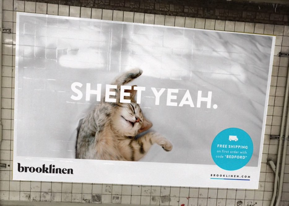 Brooklinen targets a young, professional crowd with its subway ads. The tone is lighthearted and the images reference a younger lifestyle, take-out in bed, kittens, sriracha, etc.[/caption] If we stick with the electropop music fest example, your target audience would likely be men and women, ages 16-26. If they re interested in upbeat, contemporary music, they may be more likely to want to connect, to dance, to be in an energetic environment, and to snap the perfect Instagram pic.
 Tip: Once you reach your audience, make sure to consider how you can track the performance of your poster. There are many ways to track the effectiveness of your print, but we really like QR codes on posters!
Getting the Message Across
The surface area of a poster is precious. You don t want to cram a novel into a small space. In order to distill your message, think of your product and your Call-to-Action (CTA). A CTA is what it is you want your audience to do in response.- What would you like to communicate?
- What would you like your audience to do?
- How can you say it in the fewest words possible?
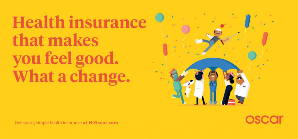 In two short sentences, Oscar explains what it offers and the novelty of its service.[/caption] We re back to the imaginary festival. You ve got a lot of bands coming and a lot of info to share. How do you let them know the festival s value and the core information like dates and artists in the most succinct and compelling way? If it s a small show, for instance, you may highlight that there are limited tickets available.
 Design 101
You ve defined your product. You ve defined your target audience. Now it s time to apply design to your brand. We ll go through and get you familiarized with basic design principles and help you select the best design choices for your poster and your identity.Color
The use of color in design is so important. Studies have shown that viewers first react to the color in a design and then quickly develop an emotional reaction to it. Warm colors like oranges, reds, and, yellows are well, warmer. They re happy, stimulating, and inviting. Think about every food app on your phone Grubhub, Yelp, Seamless. All red. This is because red is proven to initiate a hunger response. The hungrier you are, the more tacos you add to your checkout cart. [caption id="attachment_3306" align="alignnone" width="560"]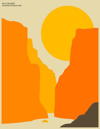 The use of warm colors helps create a sunny, happy association with Big Bend National Park.[/caption] By contrast, cool colors like blue, green, and purple are soothing and have a calming effect. It s rare you ll see a hospital or a spa with warm tones on their walls. Instead, their offices, lobbies, and rooms are coated with cool, soft greens or blues. [caption id="attachment_3307" align="alignnone" width="560"]
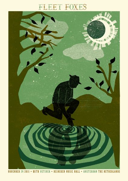 Fleet Foxes, an indie band known for harmonious vocals, uses an illustration composed of various cool, green tones to promote a show.[/caption] Blue is the primary color in this cool color batch. Because cool tones are seen as trustworthy, many businesses opt to feature blue in their logos. Twitter, Facebook, Venmo, Paypal. These businesses want you to use their platform and feel like your information, personal or financial, is safe. Both warm and cool colors can be paired with neutral colors like gray, taupe, white, or black. While neutral colors don t typically fall into a warm or cool category, they can. For instance, some browns or tans can have more yellow (warm) or more green (cool.) And while neutral colors don t provide as strong of an emotional response as the warm or cool colors, they can certainly have an effect. A strong use of black, for instance, can create a dark, mysterious mood.
 Line
A line is a distance between two points. While lines are fairly simple, the manipulation of them can cause the viewer to feel very different things. Horizontal lines, for instance, have a calming effect. Like their namesake, they have a sense of stability and tell the viewer where to look. [caption id="attachment_3308" align="alignnone" width="560"]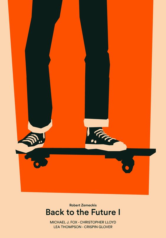 In the Back to the Future poster, the horizontal skateboard acts as a magnet for the eyes and as a visual separation between the illustration and the type.[/caption] Vertical lines give the space a sense of height, as they carry the eye from the bottom of the page to the top. They re seen as strong; think of an upright person or a pillar. [caption id="attachment_3309" align="alignnone" width="560"]
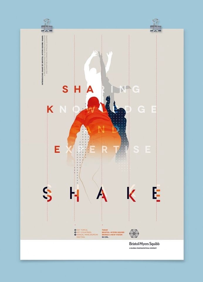 The soft vertical lines paired with the reaching bodies gives the poster a sense of height and energy.[/caption] When carefully used, diagonal lines can create a dynamic effect. They pass through the space giving it a sense of energy. If overused, however, it can create a chaotic feel.
 Shape
The use of a shape can also have an effect on the viewer. Geometric shapes have more weight and tend to represent order. Organic shapes, with their curved lines and free form, are more akin to nature and, therefore, have a soothing effect. [caption id="attachment_3311" align="alignnone" width="560"]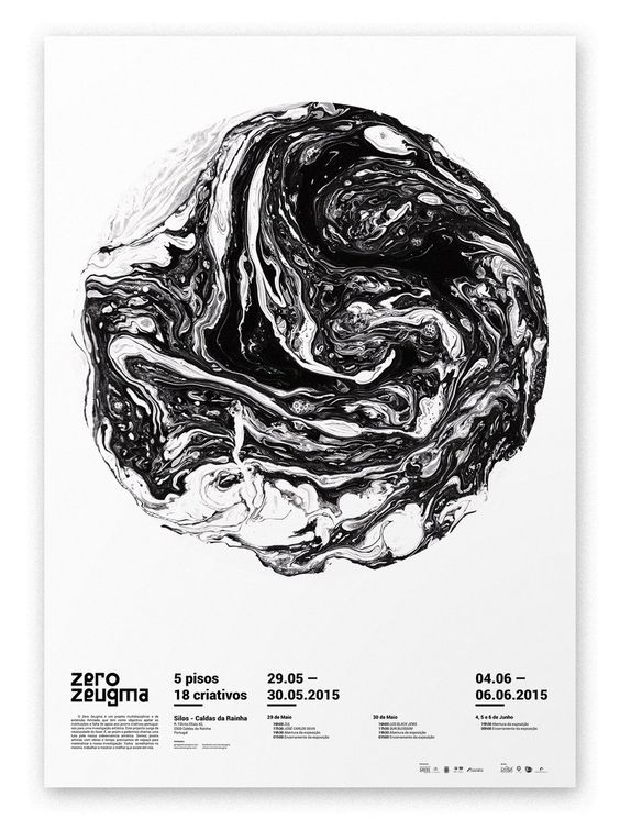 The Zero Zeugma poster has both a geometric and organic quality. The central circle appears distinct and moon-like; however, the dripping marbled paint gives it an amorphous shape.[/caption]
 Texture
While texture may not seem relevant to poster design, photographs or patterns with texture can be used to create a point of interest and captivate the viewer. For example, you could use a photograph of droplets, waves, wood grain, or thickly applied paint as a background. Each of these can create a unique effect. [caption id="attachment_3312" align="alignnone" width="560"]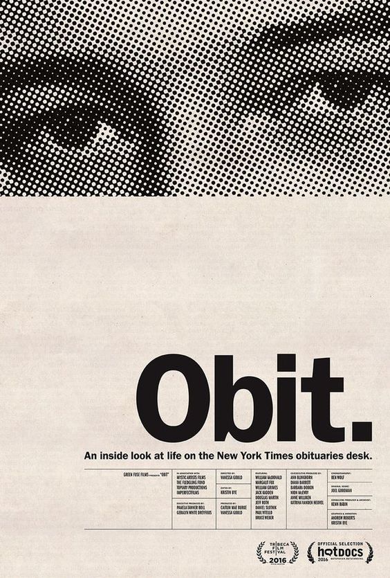 The Obit. documentary poster plays off of two distinct fields - a rasterized set of eyes (like an image from a newspaper) and a bare cream backdrop.[/caption]
 Typography
Typography is particularly important when considering the design of a poster. Typefaces fit into two general categories: serif and san serif. Serif fonts are fonts you would recognize from newspapers or novels. Each of these fonts has a little line, or a serif, at the base of each stroke. The classics are Times New Roman, Garamond, Baskerville, Georgia, and Bodoni. San serif fonts are, as you probably guessed, fonts without the serif. They are often interpreted as the more modern typeface as they are minimal and unfussy. Famous san serif fonts include Futura, Gill Sans, and the ever-popular Helvetica. [caption id="attachment_3314" align="alignnone" width="560"]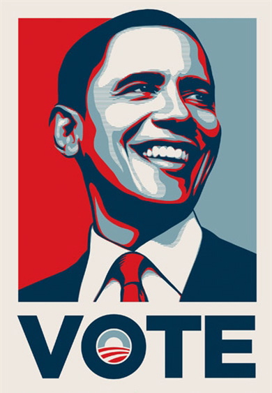 A notable use of a san serif typeface in recent history is the use of Gotham in Barack Obama s presidential campaign.[/caption] A typeface can also have a different effect when a different weight is used. Bolder fonts may make an emphasis, while thinner fonts can offer a suitable alternative for less important information. Variations like italics can have a similar effect. [caption id="attachment_3313" align="alignnone" width="560"]
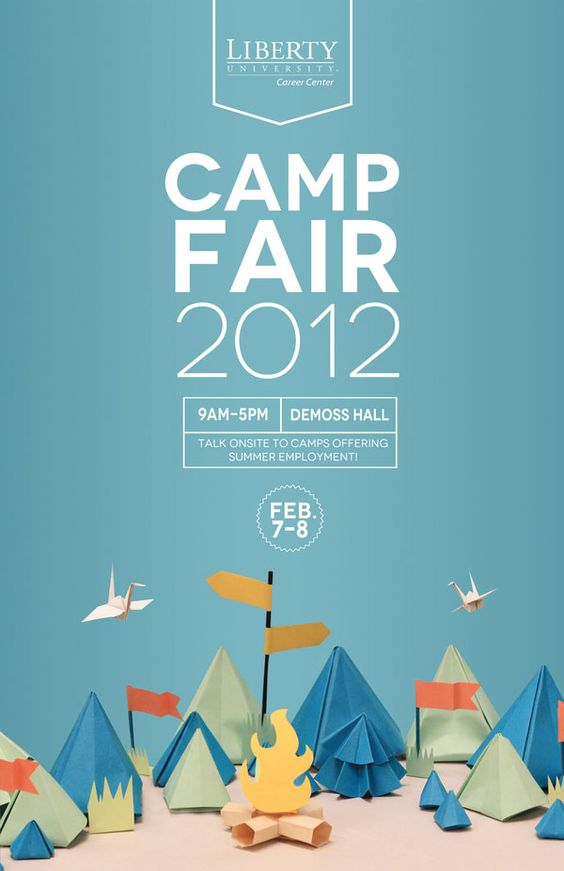 The Camp Fair poster uses the weight of the fonts to show the importance of the camp s title and the secondary importance of the year it is advertising. The use of the same font provides continuity.[/caption] To create balance and interest when designing with type, designers often pair a san serif font with a serif font or vice versa. A strategic change in typeface can break up text into different sections (title, subtitle, etc.) and give the eyes a rest from a single, overpowering font. [caption id="attachment_3315" align="alignnone" width="564"]
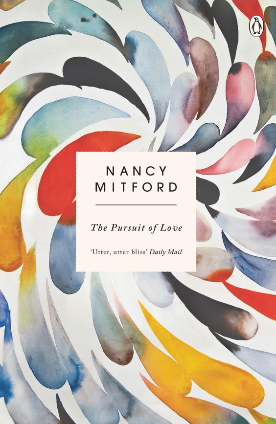 The Pursuit of Love book cover uses both serif and san serif fonts to create balance on a stark white backdrop.[/caption]
 Space
Space can be either positive or negative. Imagine a newspaper column. The white backdrop would be considered the negative space, while the object or type would be considered the positive space. [caption id="attachment_3316" align="alignnone" width="560"] In Aida Nayeban s poster, the negative space is cleverly used to depict the inner whites of the eyes.[/caption] Negative space is just as important as positive space. Without negative space, you would just have objects on top of objects. It wouldn t offer any breathability and would be cramped and displeasing. When designing, take into consideration how much breathing room each object needs. [caption id="attachment_3317" align="alignnone" width="560"]
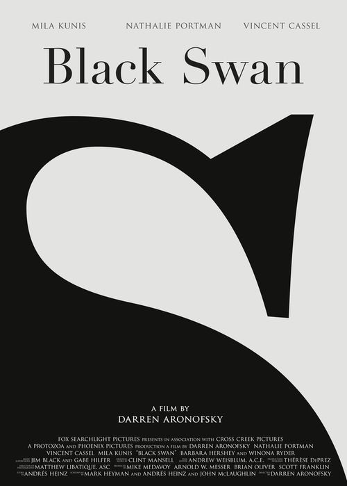 The positive space contrasted with the negative space creates an allusion to a swan and the S in the title.[/caption]
 Balance
A balanced design feels stable and visually pleasing. You can achieve this by not letting one element in the design overpower another. Instead, arrange the objects in such a way as to even the distribution of weight. You may be tempted to create balance through the use of symmetry. That s perfectly fine; it creates a pleasing response. It s important to note, though, that symmetry can sometimes become a bit boring. [caption id="attachment_3318" align="alignnone" width="564"]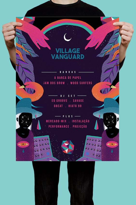 From the rainbow to the figure, the Village Vanguard poster utilizes symmetry, bright color, and a compelling illustration to draw the viewer s attention. It also features small hints of asymmetry in the tilted moon at the top and the tilted geometric shape at the bottom.[/caption] Asymmetry, however, can be visually interesting and can, therefore, capture the attention of the viewer. Asymmetry may seem in conflict with balance, but it s not. Although it s more difficult to master, by arranging asymmetrical elements compositionally, you can create a visual balance. [caption id="attachment_3319" align="alignnone" width="570"]
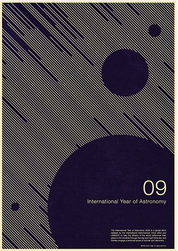 While the poster is bottom-heavy with the large circle, together the smaller circles at the top give a heavy effect that helps to balance the weight of the design.[/caption] You can also strategically leave a design off-balance to jar the viewer and cause discomfort. [caption id="attachment_3320" align="alignnone" width="559"]
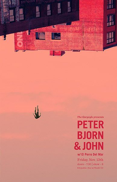 The dominance of the upturned sky combined with the backward falling figure creates tension and gives the viewer a sense of unease.[/caption]
 Contrast
Like asymmetry, contrast creates visual interest in design. By arranging elements that are opposites, you can make elements stand out and, in turn, create energy and balance in the piece. Dark and light colors. Serif and san serif. Texture and no texture. The inclusion of these in your design will make the viewer stop and pay attention. [caption id="attachment_3321" align="alignnone" width="560"]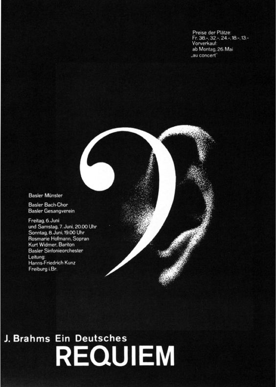 The pairing of the textured ear and the similarly shaped, untextured bass clef create an eye-catching design.[/caption]
 Visual hierarchy
People are bombarded with visuals all day long. It s important as a designer, therefore, to demonstrate what is the most important information. You can do this with strategic use of color, size, position, and contrast. For instance, you might use a higher contrast in color and backdrop to make the most important information the most readable. It is fairly intuitive, but in design, size matters. Headlines should be bigger than taglines which should be bigger than general text. [caption id="attachment_3298" align="alignnone" width="560"] The bold use of font demarcates that the title and date are the most pressing pieces of information. The position of the other text around the central title and date as well as its diminutive size, tell us that the other information is secondary.[/caption] Added bonus: Here is a slideshow with a few more posters along with my comments. [metaslider id=3281]
 Putting It Together
You ve got your branding vision. You ve covered the elements of design. Now it s time to put it all together. Before you begin, make sure you have all of the elements you need ready to go, particularly the copy and the photographs. In order to choose what colors, type, and photos to feature, revisit your branding conclusions.- Who was your audience?
- What type of things do they like?
- What colors would be appropriate for the topic of your poster, the brand image you re trying to achieve, and the audience you highlighted?
- What type would best suit your needs?
- What is the mood you re trying to achieve? How can you do that with space and balance?