20+ Flyer Examples with Design Tips to Inspire You
Design eye-catching flyers with these examples and tips.
Published Nov 13, 2018
 Flyers. You ve been exposed to hundreds in your lifetime. They re in your mailbox, crunched at the bottom of your bag. They ve been around for so long because when done right, they are an effective way of spreading the word. How is a flyer done right? It s important to consider a few things when designing yours.
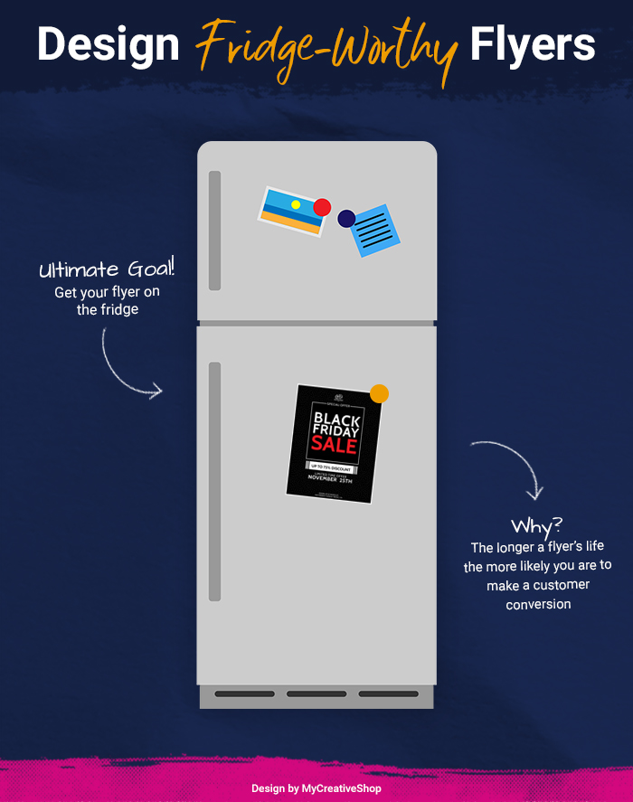
 Heads up: This article is a great read if you're interested in the design-related elements of a flyer, but we also have another in-depth article on flyers where we talk about planning, design, print, distribution and more. Make sure to check that out before you design your next flyer.Whether you re xeroxing photocopies or printing sleek mailers, a good flyer is all about good design. Color, layout, imagery these are all integral to an eye-catching, aesthetically-pleasing piece of paper. While you may be tempted to open a Google or Word Document, find a funky font, and fire off an ad-hoc flyer, it is important to consider how the recipient visually considers it. Ultimately, flyers are more successful when the new owner wants to keep it, not trash it. The hope is perhaps it will even make it to the fridge. The longer a flyer s life the more likely you are to make a customer conversion. So, a good rule of thumb is to make it fridge-worthy. (Don t worry, we ll give you pointers.)
 On the topic of conversions, it is crucial that you isolate exactly what it is you want the recipient to do. What is the Call-to-Action or CTA? Do you want them to attend an event? Do you want them to use a discount code? Do you want them to vote in a school board election? Refine your message and make sure it is clear to the viewer. If possible, it s also helpful if the CTA is measurable. This allows you to gauge the success of your flyer. A unique discount code, a flyer as proof of entry, a QR code there are lots of ways to do it. Consider what might be best for your campaign. We can talk about each of these tactics in the abstract, but if you re a visual creature, which many of us are, it may be helpful to go step by step with real-life flyer examples. In this article, we ll walk you through a few designs to help you imagine the range of tools at your disposal and get you on your way to making a great flyer.
 #1. Color Palette
[caption id="attachment_3567" align="alignnone" width="700"]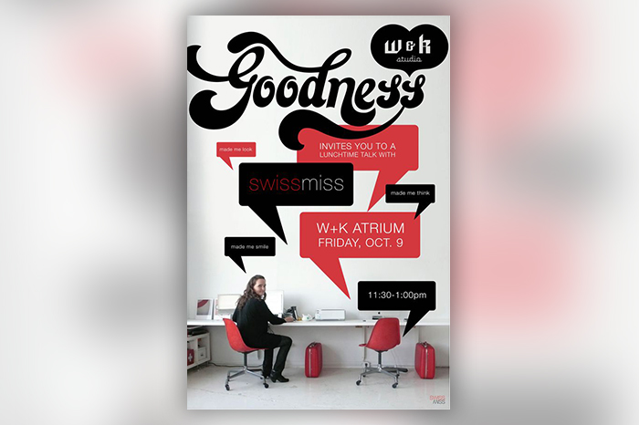 Design By Jen Cogliantry | W&K Studio[/caption] Here Jen Cogliantry & W+K have employed a few, key design principles to make a unique and stylistically cohesive flyer. They started with a color palette black and white to offer contrast and rosy red as a pop color. Despite there being a lot of text, the flyer is readable. The alternation of background colors in the speech bubbles avoid redundancy, and the contrast between the backdrop and the text make it legible.
 #2. Shape and Copy
[caption id="attachment_3566" align="alignnone" width="700"]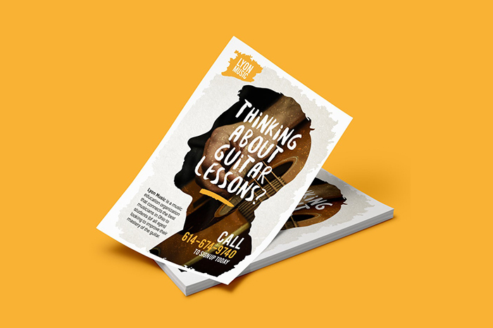 Flyer design by roberto615 | 99 Designs[/caption] Lyon Music puts a spin on the traditional music lessons flyer with a creative use of shape. The flyer uses a fairly run-of-the-mill image of a hand playing guitar, but because it s presented in a silhouette against a contrasting backdrop, it stands out. Also, note that the text includes an imaginative lead, a blurb about the value of the product, and the telephone number CTA. It includes all the necessary information. It s concise, it s legible, and it s compelling.
 #3. Target Audience
[caption id="attachment_3564" align="alignnone" width="700"]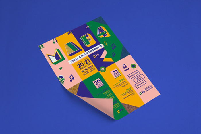 The 6th | Flyer Design[/caption] It s clear that Claudia Alexandrino knows her target audience 20-30-year-olds with an interest in art, design, and indie culture. Her color palette is fresh and on-trend, and the shapes, the squiggles, textured triangles, concentric circles, and music notes, are of-the-moment graphically. These trendy design choices tell the viewer that this flyer is for them and make them take note.
 #4. Visual Hierarchy
[caption id="attachment_3563" align="alignnone" width="700"]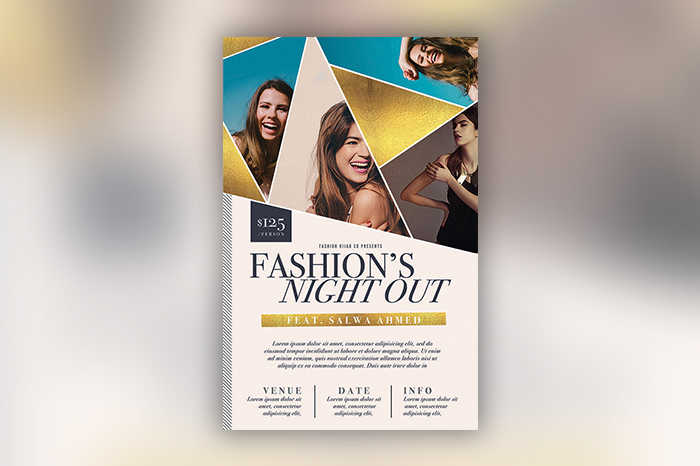 The Flyer Press[/caption] When you ve got a lot to say, it s helpful to visually indicate what is the most important information. In this case, the large, bold letters give the meat and potatoes, the event itself, and the three, titled columns at the bottom indicate that there is more, secondary info to be processed. Now, at first glance, the viewer doesn t need to memorize the exact address and the exact time, but the titles below let them know where they can reference this info later without occupying too much precious space.
 #5. Typeface and Line
[caption id="attachment_3562" align="alignnone" width="700"]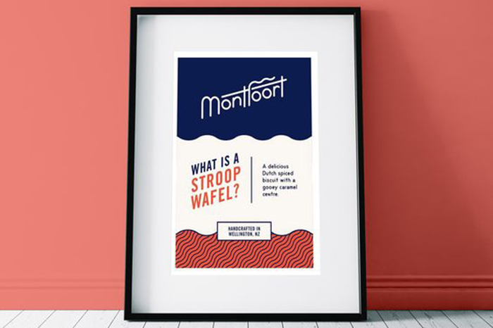 Unknown Designer[/caption] This simple, informative flyer leans on a good typeface for its point of interest. The fonts are simple and legible, but not boring. The squiggly f is a fun allusion to the squiggly lines of the product. Montfoort doesn t even include a picture of the stroopwafels here. They don t have to. The scalloped lines that outline and fill in the fields of color tell you they are a modern, fun take on a European fave.
 #6 Icons
[caption id="attachment_3561" align="alignnone" width="700"]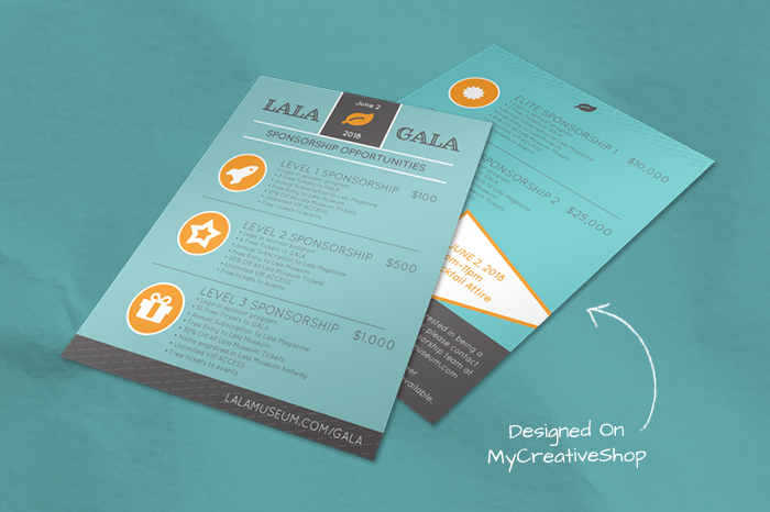 Event Sponsorship Flyer | Designed On MyCreativeShop[/caption] While it s a best practice to not crowd the space by limiting the amount of text, sometimes the essential information is a lot of information. In this case, it s helpful to use icons. These break up large blocks of copy and signal to the viewer what the chunk of text is all about.
 #7 Black and White
[caption id="attachment_3560" align="alignnone" width="700"]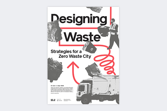 L+L cleverly[/caption] Liz and Leigh from L+L cleverly make the viewer want to look at trash. It s presumably difficult to make a viewer interested in regular images of dump trucks and garbage bales, but they ve stylistically neutralized and standardized the images by turning them black and white. The images are the same tone, and they make a great counterpoint to the bold red.
 #8 Representative Images
[caption id="attachment_3559" align="alignnone" width="700"]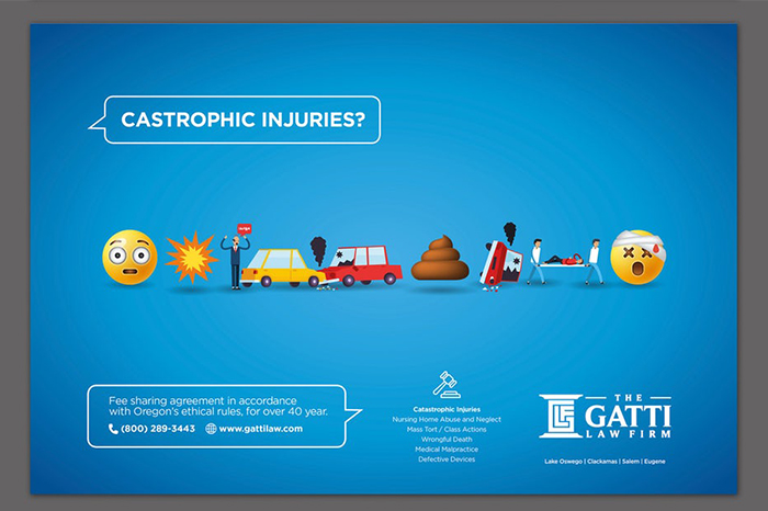 Flyer design | by SteFanzini[/caption] One way to avoid a lot of cumbersome text is to let the image do the talking. In this case, the Gati Law Firm doesn t need a paragraph to remind you that accidents are the worst. Instead, they use images we re all familiar with, smiley and poop emojis, to humorously narrate the fall out from car collisions.
 #9 Images, Images, Images
[caption id="attachment_3558" align="alignnone" width="700"]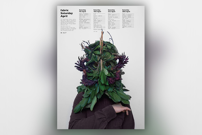 Flyer By Tom Darracott[/caption] Okay, so we don t all have access to really cool floral headgear to take pictures of, but it s important to note that the better the image, the more likely you are to capture the viewer s attention. When you have an interesting, well-shot, hi-res photo, it can occupy much more of the flyer s space.
 #10 Keeping it Simple
[caption id="attachment_3557" align="alignnone" width="700"]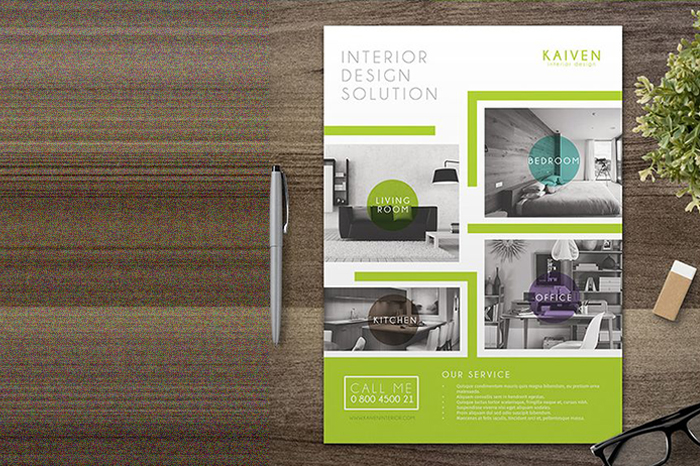 By Aarley Kaiven[/caption] You don t have to reinvent the wheel to make a good flyer. Here we see fairly standard images and fairly standard text presented in any interesting, visually-pleasing way. The visual noise from all of the colors from the various photographs is neutralized in black and white, and the pops of color help to organize information and offer an eye-catching color contrast.
 #11 Presentation
[caption id="attachment_3556" align="alignnone" width="700"]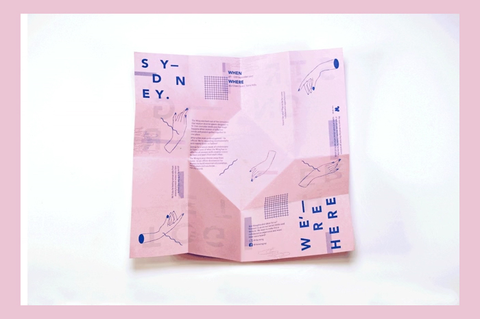 By Carmen Zeng[/caption] Thinking of how this layout works hurts my brain, but the point here is that you can think outside the box for the presentation of your flyer.
 #12 Diagrams
[caption id="attachment_3555" align="alignnone" width="700"]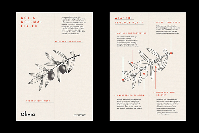 Design By Huy Ta[/caption] I ll say it all day long. The less text you have, the better. Another way to convey information without lengthy novels is the strategic use of a diagram. This diagram is particularly successful because it is simple and color-cohesive. The pop of red breaks up the text, and the black and white contour drawing of the olives is simple and digestible.
 #13 Shape, again.
[caption id="attachment_3554" align="alignnone" width="700"]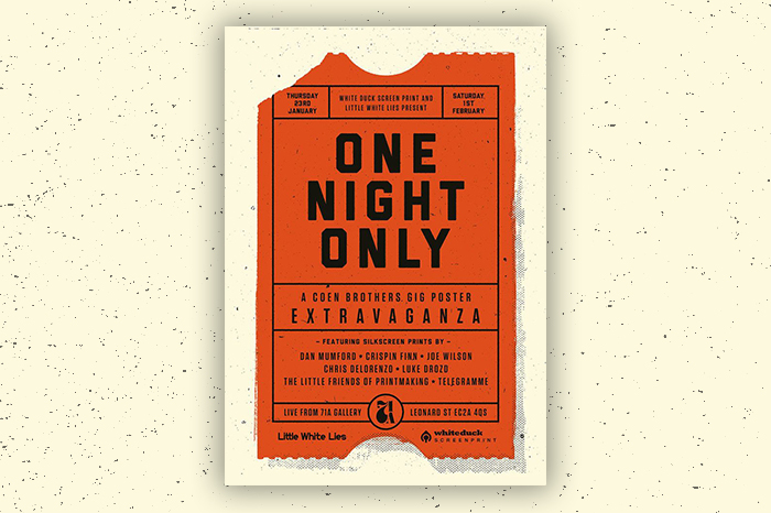 Unknown Designer[/caption] You know what this flyer is about from first glance. The clever use of the ticket shape signals that it s for an event. The designer is also cheeky here. You keep tickets. You hold on to them because they re your access to a show. It s possible that the designer s use of a ticket shape subconsciously signals to the viewer that it s a flyer they might want to hold on to. Fridge-worthy, if you will.
 #14 Get Clever with What You ve Got
[caption id="attachment_3553" align="alignnone" width="700"]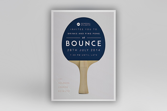 Design By Ashwin Kandan[/caption] Instead of hiring an expensive photographer or spending hours scouring the internet for ping-pong related stock imagery, the designer uses a single shot of a ping-pong paddle against a white backdrop to their advantage. Here the paddle provides a field of color for text and gives the flyer a minimal aesthetic.
 #15 Ode to the Flyer
[caption id="attachment_3552" align="alignnone" width="700"] Design By Marcel Kaczmarek[/caption] This flyer plays on the warm feelings associated with old-school flyers. With the disposable camera-like photos and the zany typeface, it looks like it could be a prop from Ten Things I Hate About You. Obviously, this flyer is done with a bit more finesse. They ve strategically selected the font, the text is well balanced, and there is no sign of Sharpie marker.
 #16 Ode to the flyer, pt 2
[caption id="attachment_3551" align="alignnone" width="700"]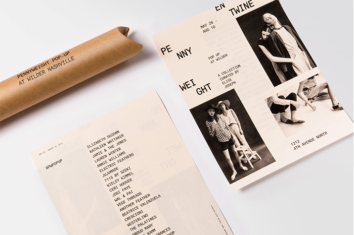 Design By Julia Kostreva Studio[/caption] While Julia Kostreva s design quotes vintage flyers with its photo layout and sparse text, it does so with a modern spin. The photos are sleek and stylized, and the typeface is modern and fresh.
 #17 Font Power
[caption id="attachment_3550" align="alignnone" width="700"] Design By TwoPoints[/caption] Two Points Studio is obviously very talented in crafting their own typefaces. We are all here to aspire. The flyer, however, is a good example of an approach you can take in your own design. Do you have limited photographic and typographic resources? Creating your own typeface can be a simple, savvy way to draw attention.
 #18 The Trusty Diagonal
[caption id="attachment_3549" align="alignnone" width="700"]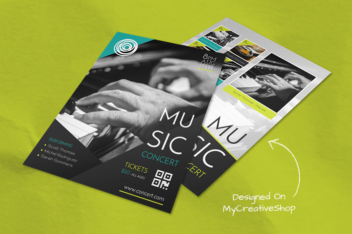 Creative Music Concert Flyer | Designed On MyCreativeShop[/caption] If you are looking to spice up your photos, composition, or text, consider the diagonal. Diagonal lines create a sense of energy and are a quick, sure-fire way to enliven your flyer.
 #19Pattern
[caption id="attachment_3548" align="alignnone" width="700"]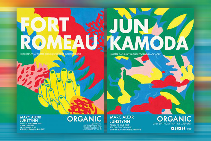 Design By Tess Redburn[/caption] The use of a pattern as a backdrop can be a good alternative to a simple color field when paired with high contrast text. Tess Redburn uses bold, white san serif lettering and a colorful abstract seascape to turn her flyer into a piece of art.
 #20 Color Variation
[caption id="attachment_3547" align="alignnone" width="700"]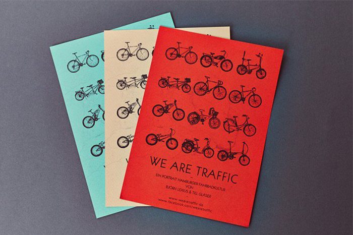 Design By Tobias Tietchen[/caption] Whether your flyer is posted or rests on a check-in desk, it can have a unique visual effect when displayed together. Here Tobias Tietchen swaps out the backdrop color from bold red to a neutral cream to switch things up a bit. If seen side-by-side, it s an attention-grabbing break from the norm.
 #21 Layout
[caption id="attachment_3597" align="alignnone" width="700"]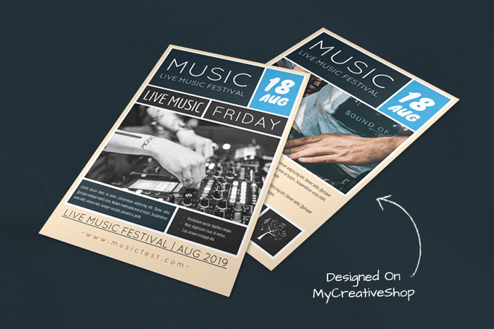 Live Music Festival Flyer | Designed On MyCreativeShop[/caption] When designing your flyer, it may be helpful to consider grouping your text and blocking it. This process can help you visualize the flyer s puzzle pieces and can allow you to play with the arrangement until you find your end result. Here we can see that the designer carefully chose a color palette a neutral, some darks, and a pop color created adjacent tiles with these colors, and organized the title, the date, description, and location within them. While there is a decent amount of text, it appears compartmentalized, not cluttered.
 Now it s time to get started on your flyer. MyCreativeShop offers an array of layout templates for every imaginable flyer need. They re customizable so you can apply some design tips and tricks to make it your own and captivate your audience.