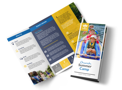
Top 5 Mistakes to Avoid in Your Church Camp Brochure Design


Welcome to the exciting world of church camp brochures! These little pieces of paper carry the enormous responsibility of capturing the essence of your church camp and enticing both parents and children to attend. A well-designed brochure can be the key to a successful camp turnout, while a poorly executed one can leave potential attendees uninterested and uninspired.
In this blog post, we'll explore the top 5 mistakes to avoid in your church camp brochure design, so you can create a brochure that leaves a lasting impression and fills your camp to the brim.
1. Cluttered Design: Less is More
When it comes to brochure design, simplicity is the name of the game. It can be tempting to pack every inch of your brochure with information, but this often leads to a cluttered and confusing design. Remember, your brochure should guide the reader's eye and allow them to absorb the key details effortlessly. Stick to a clean and minimalistic design, ensuring that each element has its purpose and contributes to the overall message you want to convey.


2. Lack of Visual Hierarchy: Guide the Reader's Eye
Visual hierarchy is essential in any design, and your church camp brochure is no exception. Without a clear visual hierarchy, your brochure becomes a mishmash of information without any focal points. Use headings, subheadings, and varying font sizes to guide the reader's eye and highlight the most important details. Consider using imagery strategically to draw attention to specific sections, creating a visual journey that leads the reader through your brochure.
3. Inconsistent Branding: Maintain a Cohesive Look
Your church camp brochure should be a reflection of your brand. Inconsistency in branding can be confusing and undermine your message. Use consistent colors, fonts, and imagery that align with your church's overall branding. This will create a cohesive and professional look, reinforcing your camp's identity. Remember, your brochure should leave a lasting impression, and consistent branding is a powerful tool in achieving that.
4. Lack of Strong Call to Action: Engage and Persuade
Every effective brochure has a strong call to action that motivates the reader to take the next step. Whether it's registering for the camp, visiting your website, or contacting your church for more information, your call to action should be clear and compelling. Use persuasive language, create a sense of urgency, and include contact information or website URLs prominently in your brochure. Make it easy for your potential attendees to take action and engage with your camp.
5. Poor Printing and Paper Choices: Opt for Quality
Finally, the physical quality of your brochure can significantly impact its effectiveness. Don't let all your hard work designing a beautiful brochure go to waste by printing on low-quality paper or using a printer that produces subpar results. Invest in high-quality printing that brings out the vibrancy of your colors and showcases your design in the best possible light. When it comes to paper choices, consider the weight and finish that best suits your design and budget. Your brochure should feel substantial and reflect the care and attention put into its creation.
Conclusion
Avoiding these top 5 mistakes in your church camp brochure design will set you on the path to success. Remember, simplicity, visual hierarchy, consistency, strong calls to action, and quality printing are all key elements to consider.
By creating a well-designed and thoughtfully executed brochure, you can captivate your audience and ensure that your church camp stands out from the rest. Get started today!