The World's Most Expensive Logos [Top 10 Edition]

The cost of logo design is not something many people are aware of.
Everyone has a general idea of the price of branded products, such as Nike trainers or Levi jeans, but few understand the expensive process of designing a profitable logo.
A simple emblem can both be very costly and a great marketing tool. Think about McDonalds. The fast-food chain s yellow M is recognizable all over the world their unmistakable Golden Arches logo draws customers wherever they re situated.
The most expensive logos aren t always the most obvious, but they often reflect the sheer size and wealth of the companies in question. We ve put together a guide to the 10 most expensive logos in the world.
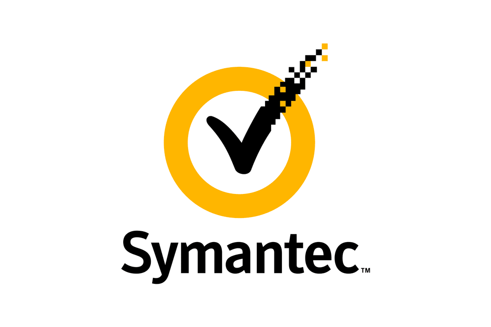
1. Symantec Brand & Acquisition - $1,280,000,000
Over $1 billion dollars seems a little exorbitant for a logo, no matter who it s for.
Symantec Endpoint Protection, however, purchased the VeriSign tick in 2010; an investment costing them $1.28 billion. This resulted in Symantec being able to add the VeriSign check mark to their old logo something to indicate their authenticity and credibility.
2. British Petroleum Logo & Marketing - $210,000,000
The British Petroleum (BP) logo is a globally recognized design resembling a green and yellow flower-like emblem the Helios. BP s intention with this logo was to give the impression that they care about the environment and are committed to combating global warming.
Helios is the name of the Greek sun god, and the crown-like flower conjures ideas of energy and nature.
3. Accenture Logo Design - $100,000,000
This logo consists of the company name in lowercase letters (accenture), underlined by the words High performance. Delivered and sporting a greater-than sign above the letter t. In 2017 the style of the logo was slightly altered. The font now used is Rotis Sans Serif Extra Bold 75.
Accenture, a giant agency that specializes in technology management and consultancy, were aiming for a logo to inspire consumers and communicate the brand s focus on progress and the future.
4. Posten Norge (Rebrand) - $55,000,000
Founded in 1647, Posten Norge, the Norwegian postal service governed by the Norwegian Ministry of Transport and Communications, has grown its net income to 13,000,000 Norwegian krone (around $1.4 to 1.5 million).
Its rebranding process in 2008 gave birth to the logo currently used: a clean sphere in gray and red and posten (lowercase), also in red. The company s headquarters are in Oslo, Norway s capital.
5. Australia & New Zealand Banking Group (ANZ) Logo - $15,000,000
As was the case with Symantec, the Australian and New Zealand Banking Group (ANZ) arrived at their current logo when two separate banks (Australia and New Zealand) joined forces. Their logo comprises of their abbreviated name, ANZ, and an emblem resembling a blooming flower both in the classic blue that has been part of their company s profile since the 1950s.
According to ANZ the symbol contained in their logo represents a lotus, with the three elements (two leaves and one flower) acknowledging Australia, New Zealand and Asia Pacific. M&C Saatchi designed the logo.
6. BBC Logo (Redesign) - $1,800,000
English speakers all over the world can recognize the BBC logo three white letters standing out against three black squares. The giant and well-established broadcasting corporation acquired its first logo in 1958, while the current design has been in use since 1997.
Recently, the BBC splashed out and updated its logo again, but many have commented it looks much the same. The simplicity of their logo old and new makes it easy to recognise and remember, while the use of black and white leaves a striking impression.
7. CitiBank Logo Design - $1,500,000
CitiBank, a division of the multinational Citigroup, boasts a total of 2649 branches across 19 countries - making it unsurprising that their logo cost a whopping $1.5 million to create.
Paula Scher of Pentagram designed the current logo (the word citi in blue topped with a red arc) in 1998. Scher is the brains behind a huge number of brand logos, including Microsoft, the Museum of Modern Art and Bloomberg.
8. Pepsi Logo Redesign - $1,000,000
Coca-Cola s main competitor, Pepsi, has always stuck closely to a red and blue colour palette. It originated in 1893 as Brad s Drink and shortly after, renamed to Pepsi-Cola .
The original all-red logo of Pepsi-Cola got a revamp in 1950 when a touch of blue was added, also a nod to the red, white and blue of American patriotism after World War Two.
Pepsi s logo is still red, white and blue; its circular shape has long been associated with the brand, as it was originally based on the shape of a bottle top. The current, streamlined version of the Pepsi logo was designed in 2008 and referred to as the Pepsi Globe .
You ll find Pepsi branding on everything from T-shirts to cool drink cups, and it s simple, crisp design ensures that it prints clearly on just about anything, and with any type of printer.
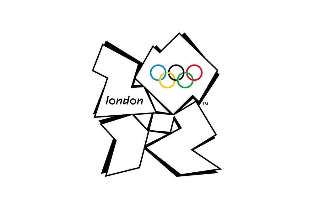
9. London 2012 Olympics Logo - $625,000
It s no surprise that one of the most expensive logos in the world was for the Olympic Games. The London 2012 Olympic Games logo drew some criticism for its complex style but is certainly easy to distinguish.
In the logo the year 2012 is depicted in an angular and stylized square, containing the word London and the Olympic rings in the upper half of the design. Wolff Olins conceived the design in 2007. Olins has also designed the logos for TikTok, Tesco, and Uber.
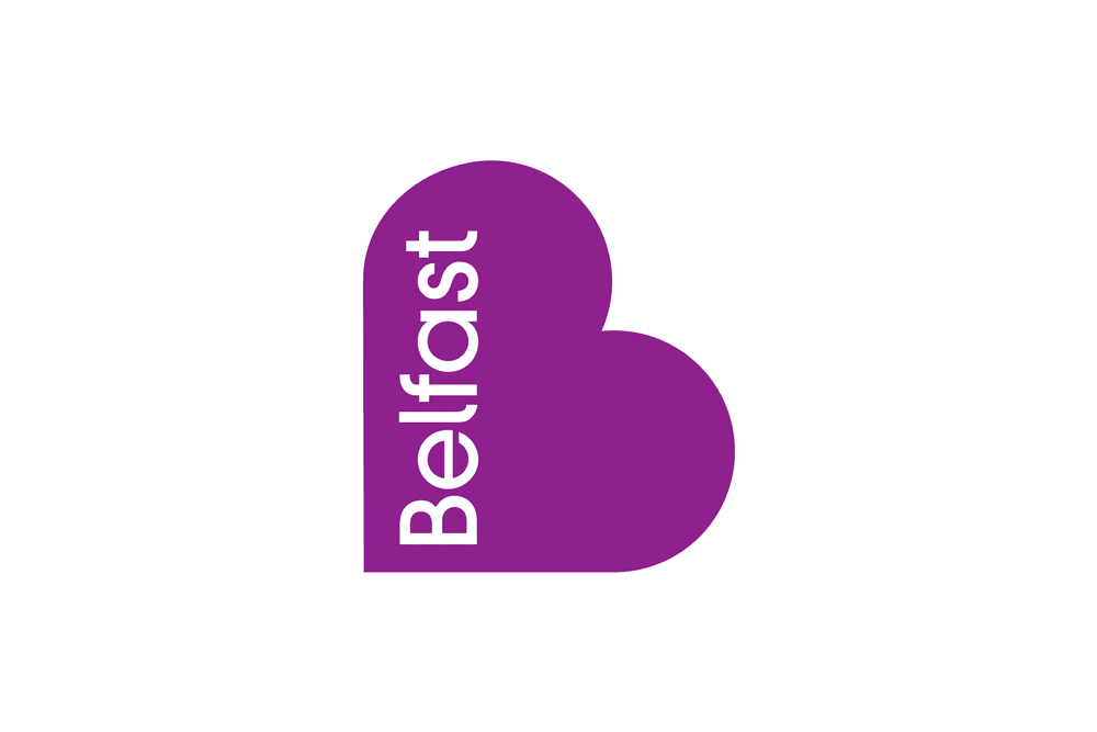
10. City of Belfast - $280,000
It might seem odd at first, but cities do actually have their own logos. In the case of Belfast, Northern Island s capital, their heart-shaped design intended to convey a feeling of vibrancy, inclusion and the message: welcome to Belfast.
While that particular logo was an expensive investment, it didn t end up sticking. Belfast s current logo is an angular starburst that's supposed to resemble the shape of the city. Its introduction in 2017 was controversial many thought it a waste of money.
Is It Worth It?
Whether or not a logo is worth hundreds of thousands of dollars is debatable. What is clear, however, is that a strong visual symbol is important to companies who want to be taken seriously.