Data Studio: An Introduction Using March Madness Data
Learn how to turn March Madness data into stunning dashboards and reports using Google Data Studio.

Dustin Hodgson
Published Mar 14, 2018
 For as long as I can remember, I've been around the game of basketball. Earlier years meant that I was in a gym, while present day has me watching from my couch. Either way, I love it, and I love March Madness ! So, I thought to myself, what better way to introduce my affinity for Google Data Studio than with some March Madness data? **For the sake of this post, I'm going to assume you've never heard of Data Studio, but that you have, in fact, heard of March Madness.**
 What is Google Data Studio?
Straight out of Google's mouth: "Google Data Studio (beta) turns your data into informative dashboards and reports that are easy to read, easy to share, and fully customizable." Straight out of MY mouth: Data Studio allows anyone to take data (from multiple data sources) and present it in a much more visually appealing way. It's kind of like that movie, "She's All That," from back in the 90s. Data before Data Studio Data with Data Studio
How much does it cost?
Free - Google doesn't need your money, they just love the data. ;)Is it easy to learn?
Yes, but just like anything, it can get complex depending on what you want out of it. For this post, we'll keep it very simple.Getting started with Data Studio
First things first - let's introduce a few basic terms to make sure we're speaking the same language.- Data Source: A data source is where your data resides. In this tutorial, your data source will be a Google Sheet (spreadsheet).
- Dimensions: A dimension is a data category that represents the values within it (i.e. Team). These are your Google Sheet's headers.
- Dimension Values: Dimension values are the data options contained within the category/dimension (i.e. Virginia). These are the contents of the Google Sheet's cells under each header.
- Metric: Metrics measure the things contained in dimensions. They are always numbers whereas dimension values can be any type of data.
1. Create a Data Studio account.
Go to Data Studio and sign up for free using your Google account.2. Add our data source to Google Drive.
Sticking with the March Madness theme of this post, we're going to use a Google Sheet I built, March Madness 2018: Complete Players List, as our data source. Simply click on the link to the Players List above and then click the "Add to My Drive" icon shown below.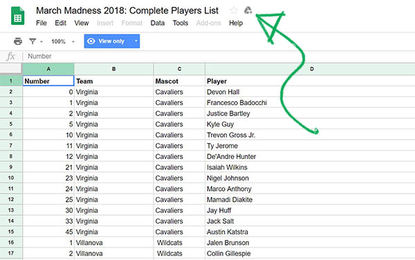 Great, now you not only have your data source stored in Google Drive, you also have a list of all of the players competing in March Madness! That only took me 1 hour to build using a Chrome Table Capture plugin and some spreadsheet work. Data was collected from ESPN, so blame them if it's incorrect, not me!
 3. Adding your data source.
Go to your Data Studio Dashboard and select the "Data Sources" option to add our player list.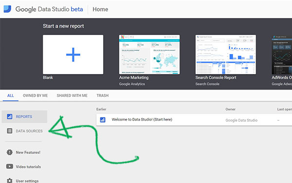 Then select the blue "plus" button in the bottom right to add a new data source.
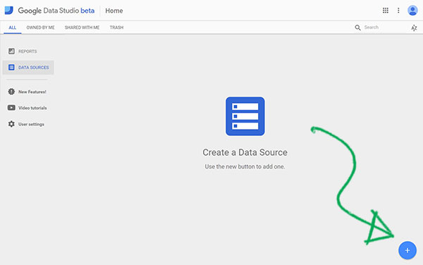
Note: If you're a first-time Data Studio user, you'll have to click through a brief pop-up with terms, conditions, and notification preferences before you can connect your data source.For this tutorial, we're going to use the Google Sheets connector, but I recommend trying the Google Analytics connector if you get hooked after this.
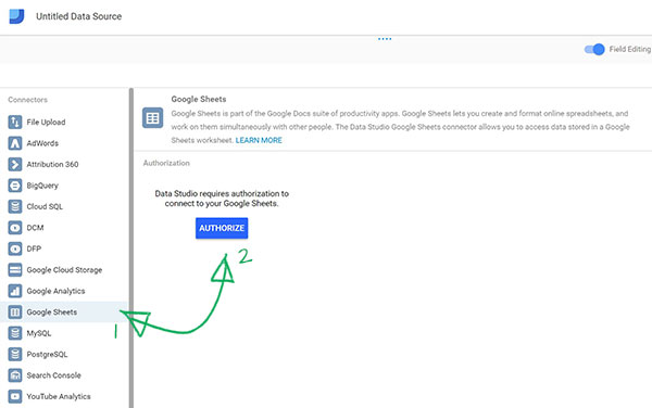 Once you select the "Authorize" button, you will be shown a screen like the one below. This will be a list of all of the Google Sheets in your Drive account. We're using the March Madness spreadsheet, so choose that one (it should be on top).
 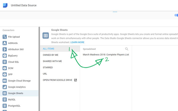 After you select our spreadsheet and corresponding worksheet, click "Connect." The options that are selected by default are just fine.
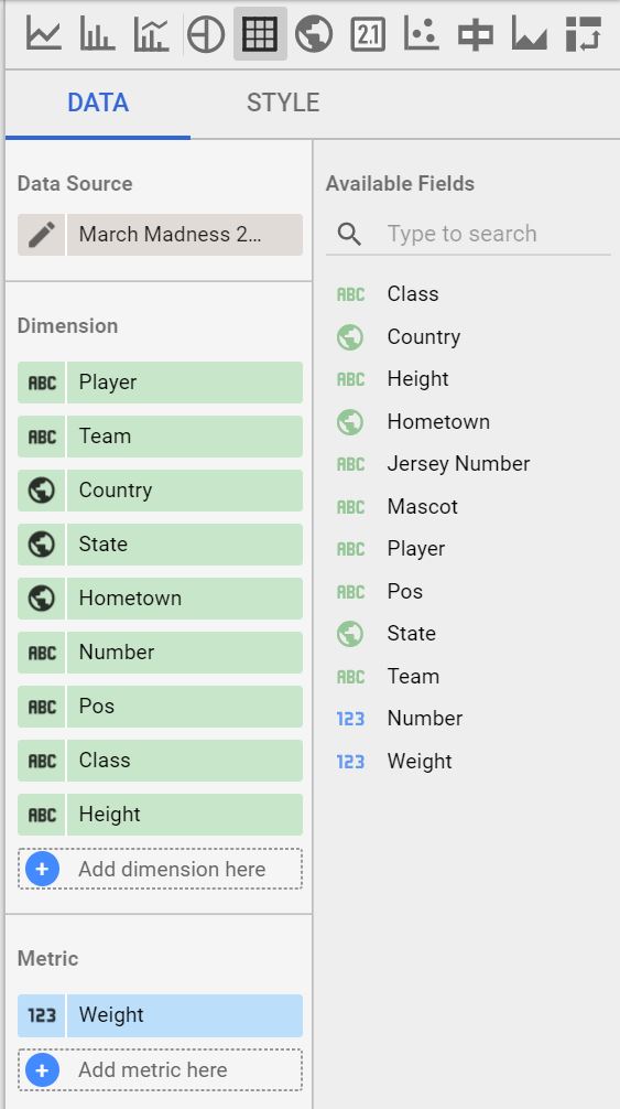
 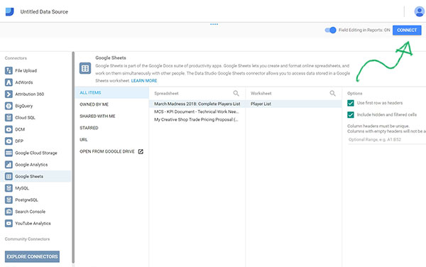 Now you're greeted by the last screen before we get into designing your report! We're so close to the fun part. This step can be fairly intimidating, but let me walk you through it. What you're seeing are the dimensions that Data Studio found in the spreadsheet. Remember, a dimension is a data category that represents the values within it (i.e. Team).
 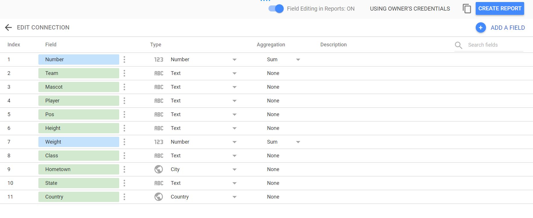 The only action we need to take here is to make sure that Data Studio is understanding what each dimension means. In this case, we do need to make some changes. I've highlighted them all below, so you can easily follow along. To start, click the three dots next to the "Number" field and select "Duplicate." Then proceed to rename the new field to match the below screenshot (I named it "Jersey Number"). Change any other field types or aggregations to match the screenshot also.
 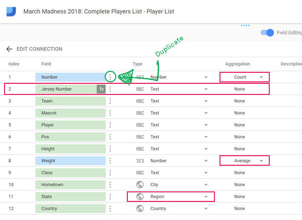 To switch "State" to a "Region" type, click on the Text dropdown, select "Geo" then select "Region" from the second flyout menu.
 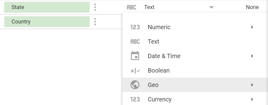 Whenever you're ready, click "Create Report" and confirm that you want to add the datasheet to your report. Congratulations! You're now ready to move on to the fun part.
 Building your report
There is a lot to take in here and rather than go into detail about every little thing I suggest you check out Google's Help section. Back to the report - how about we add a map of the United States that shows where every player is from? First, click on the "Globe" icon in the top bar above the canvas to switch your mouse pointer to the Geo Map tool. This bar is where you'll go to insert all of your reporting elements.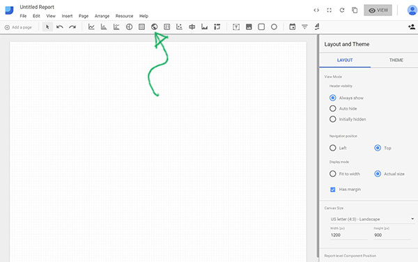 Once you've switched your pointer to the Geo Map tool, you'll need to click and drag to draw out your map frame in the canvas area. By default, the map will choose the dimension of Country (and show you a world map). Since we only want to show the United States for now, switch the dimension to State instead, by clicking where the green arrow is pointing below.
 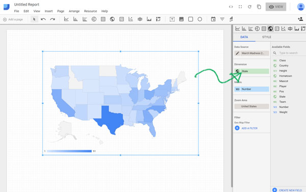 A few things are going on here that I want to highlight:
 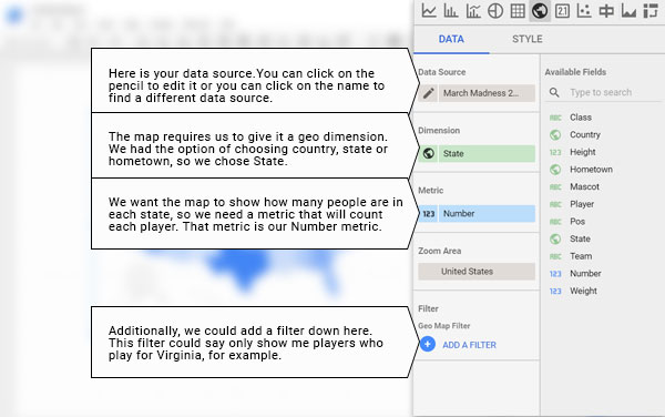 Moving along, let's style the map, so it looks the way we want. I'll point out where the style nav is and you can mess around with it however you like.
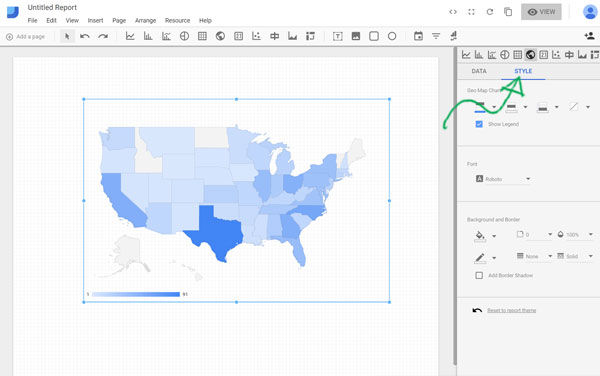
Tip: You can toggle between "Edit" mode and "View" mode by clicking on the button in the upper right. At the moment it should say View (which actually means you're in Edit mode).It's also worth mentioning that in View mode, you can mouse over each state to see the count of how many players are in that selected state. Let's add some more stuff to this canvas! It feels like the clock is running down and I should heave up a 40-footer. Here goes nothing!
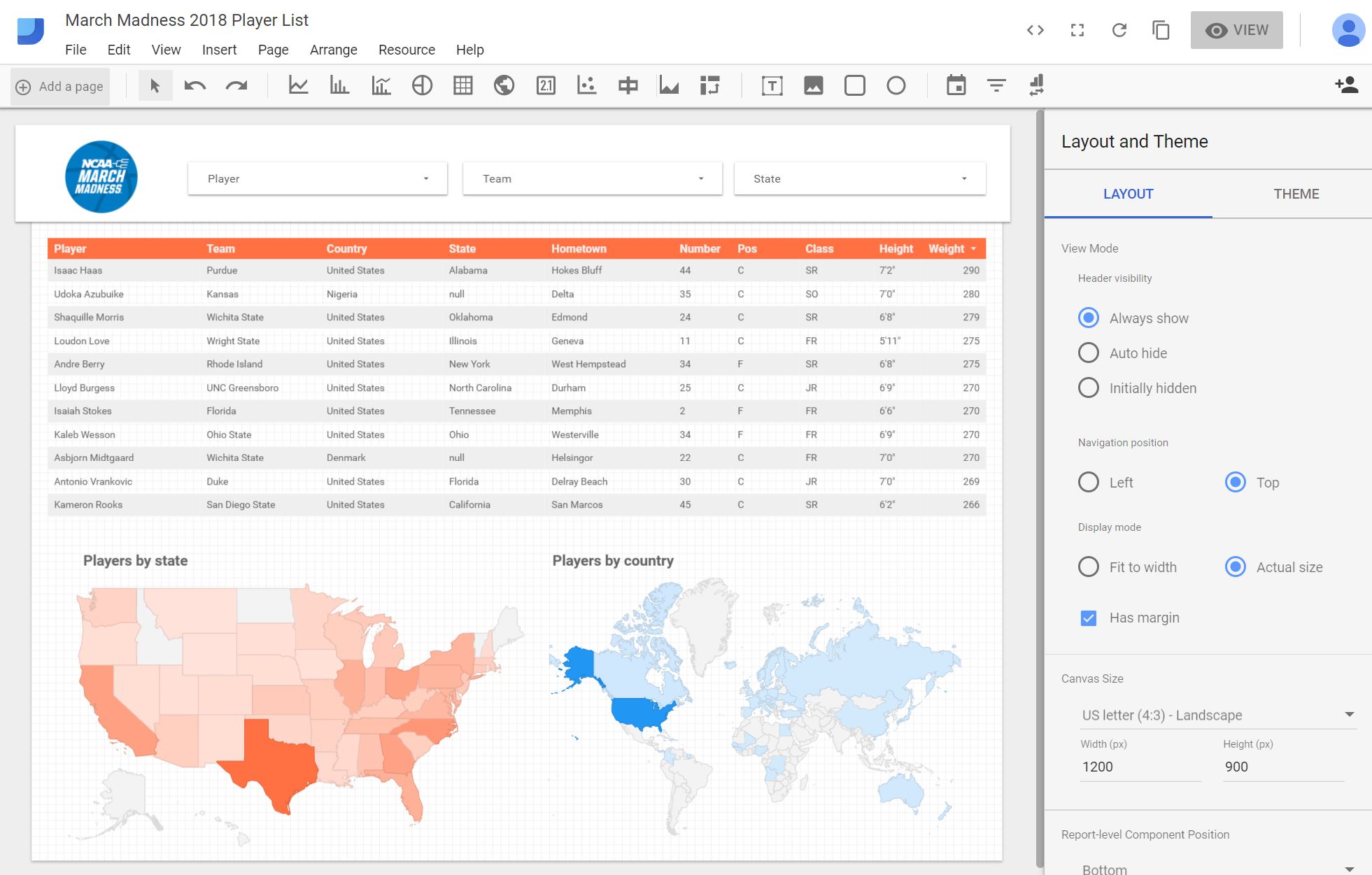 Wow, what just happened? Let me show you...
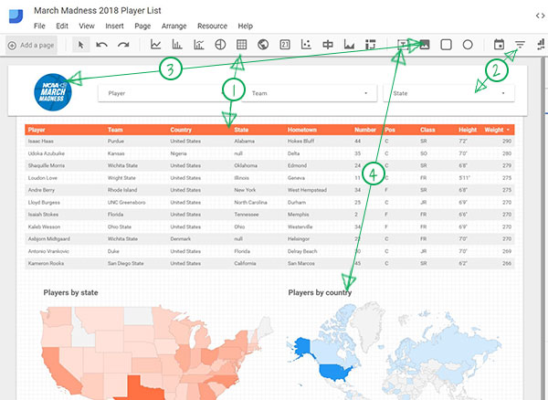
- I inserted a table by clicking on the "Table" icon (the 3x3 grid next to the Globe) to switch to the Table tool. Just like the Geo Map, I clicked and dragged to position it on the canvas.
- Using the Data nav, I added multiple dimensions (one at a time) to create the columns and included a screenshot below.
- Our metric for this list was "Weight," which I added from the Data nav.
- I changed rows per page to 5000.
- I styled it by clicking on the style nav like we did with the map.
- I added filters to control the data on the page by clicking on the "Filter Control" icon to activate the Filter Control Tool and drawing it into the canvas.
- I made 3 filters (Player, Team, and State).
- Each filter required the corresponding dimension to be selected on the right panel.
- I added the March Madness logo by clicking on the "Image" icon and drawing it into the canvas.
- I had to click on the "Select a file" button to upload my image.
- I inserted 2 textboxes to title the maps by clicking on the "Text" icon and drawing them into the canvas.
- I used the right style panel to adjust font size.
- I added a world map to display players by country using the Geo Map Tool.
- I didn't highlight it in the screenshot above, but to change the name of the report simply click on the upper left where it says "Untitled Report."
 Well, we did it! Full Player List For March Madness 2018 built with Data Studio You can also embed the report, by clicking on "File" in the upper left and selecting "Embed report." To share what you built, you can click on the "Share" icon in the upper right. There is so much more you can do with Data Studio. The really cool stuff happens when you start to have multiple data sources inside a single report, but starting from a Google Sheet is a good way to understand the basics. Thanks for learning with me!