10 Design Lessons From Starbucks' New Brand Guidelines

Starbucks new brand guidelines outline exactly what we already knew: they have strong marketing design that keeps us coming back for more. The good news is that even a small business can replicate what Starbucks is doing to create a recognizable outward-facing brand you just need to prioritize consistency.
Use these 10 lessons as a framework for developing guidelines which will dictate every marketing design you create.
Related article: How to Create Your Visual Brand Strategy With MyCreativeShop
#1: Always Be Ready to Evolve
Your customers don t stand still, and your marketing and brand design can t stand still either. The first line in the Starbucks' Creative Expression brand guide says, As we evolve to meet beautifully diverse customers all over the world, our brand has evolved, too. Whether your brand is big or small, all customers are the same they re constantly evolving and changing.

As such, you need to be ready to alter your brand design to meet their needs. If you stay stuck in the same place, you risk losing the emotional connection because they ll no longer identify with your brand, which is what ultimately drives sales and customer loyalty.
#2: You Don t Have to Do a Total Overhaul
To revamp your brand look and design, you don t need to start from scratch and unveil a completely new look. As the new Starbucks' brand guidelines outline, Here we introduce a fresh new design system that maintains the core elements of our brand while keeping our customers experience central to creative expression.
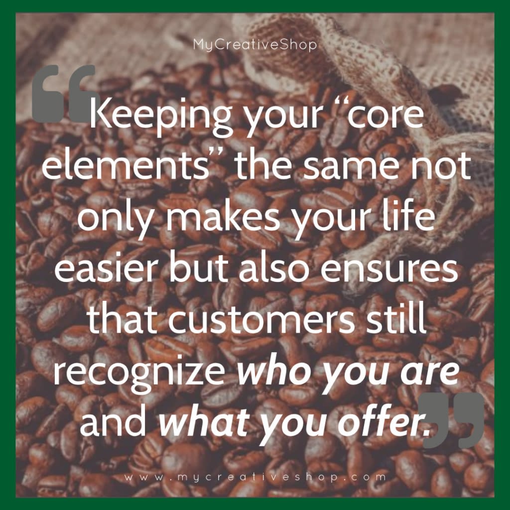
Keeping your core elements the same not only makes your life easier but also ensures that customers still recognize who you are and what you offer.
As Starbucks says: By consistently utilizing the Siren logo, an expanded palette of greens rooted in our iconic green apron and a constrained family of harmonious typefaces, we bring purpose and cohesion to every interaction customers have with our brand.
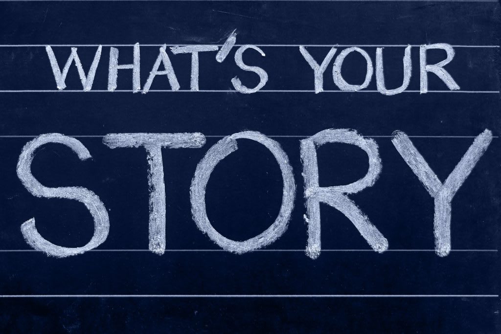
#3: Your Brand Design Needs to Tell a Story
Great design isn t just based on what you think looks good. It s not even totally reliant on important factors like color psychology. Great design tells a story and, ideally, your brand design speaks to your mission as a company.
This is at the core of Starbucks' brand guidelines. They explain, From farmers, roasters and baristas to writers, designers and illustrators, we believe in the power of both coffee and art to connect people and communities. Our new creative expression marries the artful core of our brand with helping our customers where they are, on their terms.
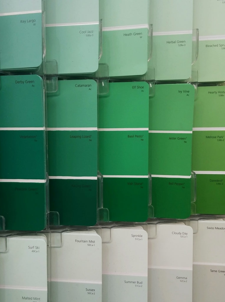
#4: Find Your Neutral Go From There
You know Starbucks when you see that dark green, from their decor to the cups. They explain that this is their most identifiable asset, and as such they leverage various shades of this color as the base of all their brand design.
#5: Flex Design With the Seasons
Starbucks doesn t just stick to one palette. They change their color scheme with the seasons, which allows them to stay relevant and recognizable. You can see below that their summer palette differs from their spring palette with more pinks and bright colors.
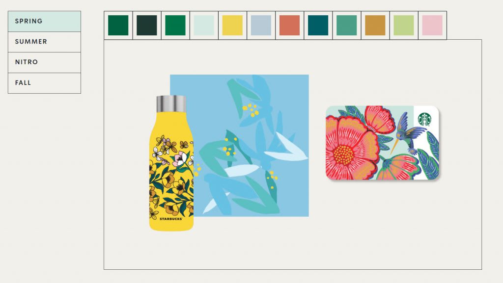
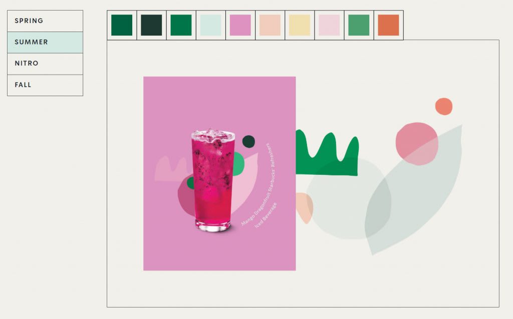
When developing your brand guidelines, plan for all seasons most specifically the seasons when you re busiest. Staying relevant allows you to drive more impressions and engagement on social media while also ensuring that your customers are attracted to your advertisements, both online and offline.
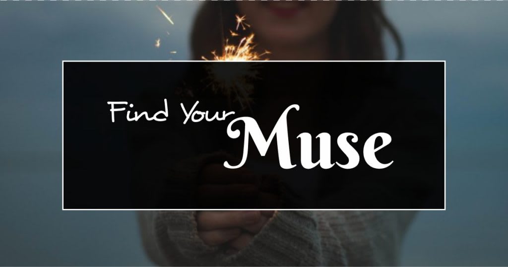
#6: Find Your Muse
Starbucks muse is The Siren the famous face you see on every cup, bag, and piece of Starbucks' swag. She is the face of their brand. Knowing your greatest brand design asset, and how to best use it in conjunction with your logo, will allow you to evolve and grow your brand design as necessary.
Starbucks explains, The preferred approach is to use the Siren logo by itself, unlocked from the wordmark. This allows flexibility to present the Siren with greater prominence while maintaining a considered, open and modern presentation.
Find your most identifiable brand asset and build it into your design so it becomes recognizable.
#7: Be Creative and Consistent with Font
Starbucks uses three fonts: Sodo Sans, Lander, and Trade Gothic. Choosing your brand fonts can be challenging, but when you do, it s important that you build them into your design consistently. What s more, consider that each of your fonts, if you use more than one, can serve a different purpose.
For example, Starbucks says, Sodo Sans is our most versatile typeface, frequently used for body copy, while Lander is used for expressive moments, and Trade Gothic is used for headlines.
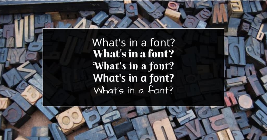
Define this in your style guide to create consistency in all of your assets, from flyers and brochures to social media campaigns.
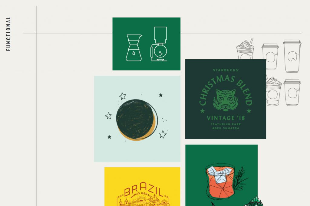
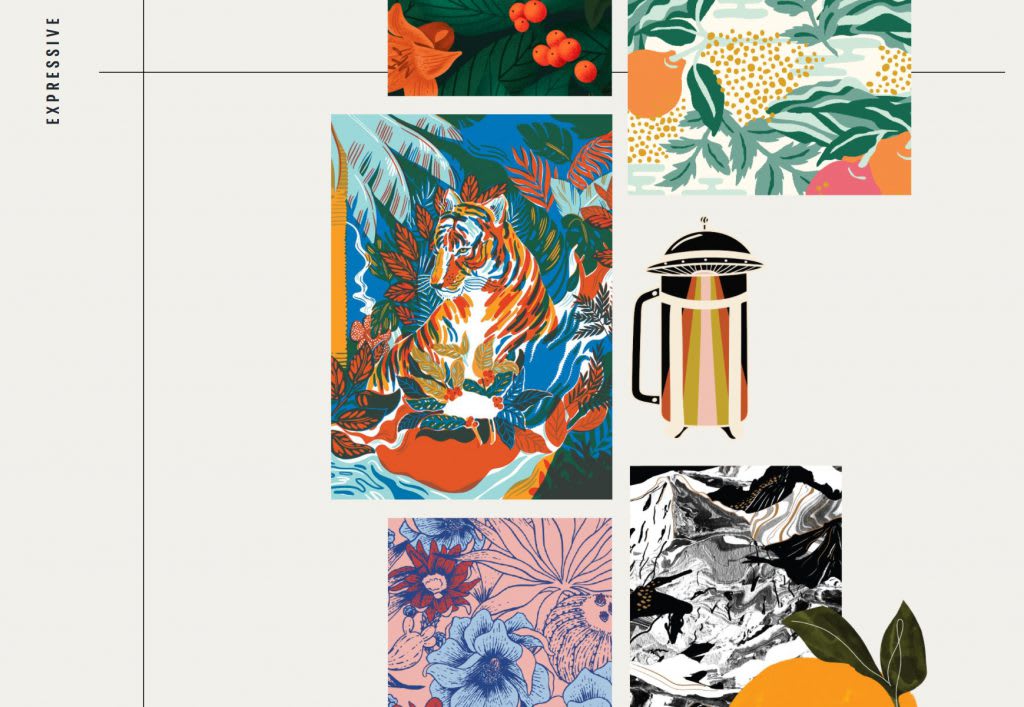
#8: Find Your Unique Look
Starbucks uses illustrations to bring their brand to life and these works of art are based in what they do, while also being unique to their brand.
They say, Our approach to illustration is rooted in our brand and legacy, and it s evolving with trend. Content should relate back to coffee or our heritage in some way, while texture, photo collage, composition, and graphic details can be used to give a custom feel.
What s more, you can see that these designs (following) serve different purposes, from functional to expressive and each piece speaks to their brand in a different way while still being recognizable.
#9: Don t Underestimate Photography
In our image-focused world, the importance of great photography cannot be underestimated. That s why Starbucks makes this a priority but they aren t stuck in one look or feel. As they explain: Our photo style is evolving with trend, innovating on subtle details like lighting, shadow, angle, and composition while creating a brand-consistent look.
What s more, they spell out what the imagery should look like, where it s to be used and what it should represent. For example, see an excerpt from their style guidelines for Editorial Photography :
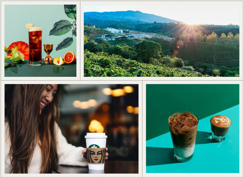
Like your design, your product and marketing imagery needs to evolve. To stay on top of trends, invest in brand photoshoots, which can be built into your marketing calendar. Budget for the cost at the beginning of the year or quarter and you ll stay ahead of your competitors.
#10: You Can Design Like a Pro On a Budget
You don t have to be Starbucks to have a strong brand design that s recognizable. To develop a consistent brand look, you simply need time and attention. Choose your fonts, define your imagery style, and pick your colors. Outline it all in a document and make sure that anyone designing marketing assets for your brand has access to it.
You can create a memorable brand with a small budget. The number one lesson from Starbucks' new brand guidelines is simple: consistency matters. Stick to what your brand stands for and you ll be in the right place.
************************************************************************
Ready to implement your new guidelines? MyCreativeShop has a variety of templates to get you going, so start now!