10 Creative Poster Typography Examples

Typography has the power to transform a reader s experience. Effective typography can display a cohesive brand, but also guide the viewer through the text and content on the surface while making your message more impactful. This is critical to keep in mind as you design your poster.
Font vs. Typeface vs. Typography: What You Need to Know
Font and typography are not the same. Font is a particular style of text, (like Raleway, size 10), while typeface is the entire family of text (including the bold, thin, and italic versions). Conversely, typography refers to the process of arranging the text, and is affected by the size of the font, the spacing used, text hierarchy, and more, according to CreativeBloq.
Another way to separate the two is this: Font is what you use to design, and typography is what the viewer sees.
When you understand the nuances between font and typography, you can begin to unravel how different font combinations can make your marketing stand out and drive home your messaging. Especially with posters, which need to catch the viewer s attention quickly.
Use these examples of dynamic typography to glean insights for your next poster design. To get the rest of your poster looking perfect, check out our blog post, How to Make a Poster: Design and Branding 101.
1. Simulate 3D Effects
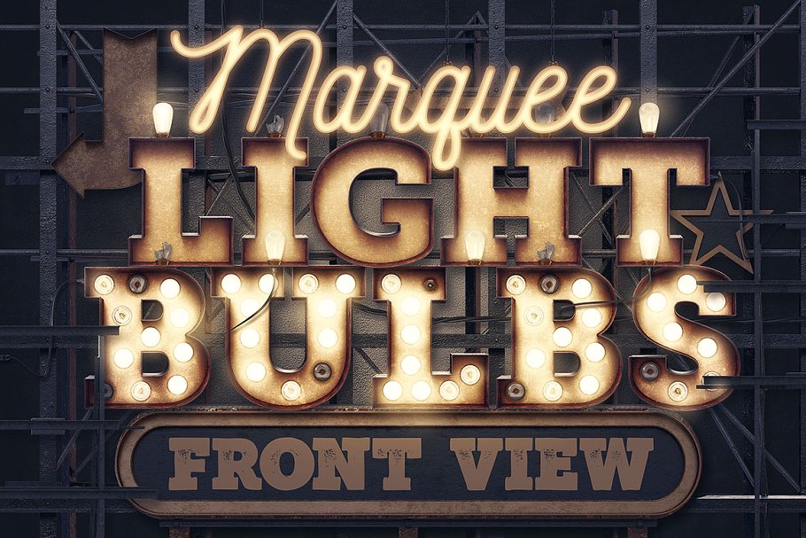
It might be too on-the-nose to suggest 3D effects to make your design pop off the poster, yet, it s a tried and true strategy for a reason. The marquee-style typography in this design makes you feel like you re standing in front of the building. The 3D effects stand out, but doesn t intrude the viewer's space and rather, invites the viewer to take note.
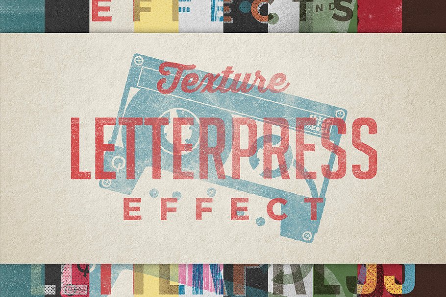
2. Use Different Textures
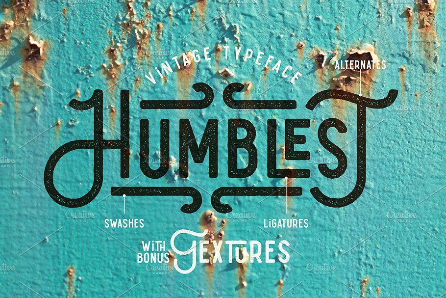
You typography doesn t have to be flat like the poster. The effect used for this poster makes the viewer want to touch the poster and feel the grainy texture. Match your textured typography to your overall design and branding goals to pack an extra punch. For example, this poster would be effective for advertising an antique store that uses reclaimed hardware.
3. Transform Text Into Something Else
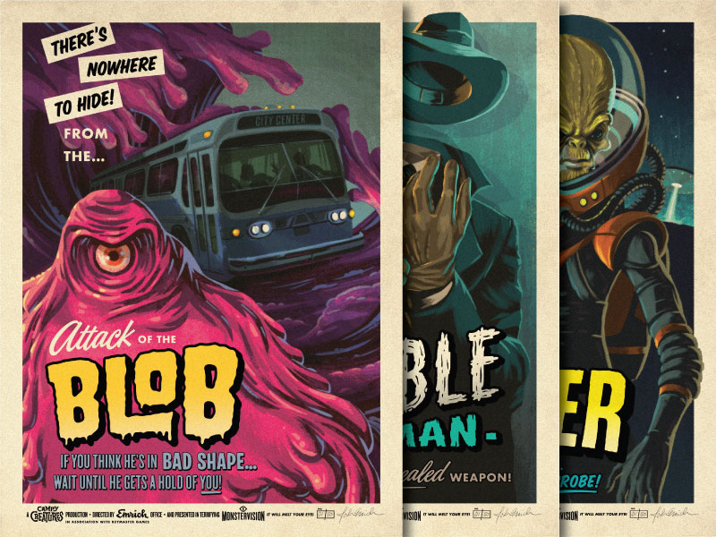
In this retro movie poster, the word Blob resembles the monster in the film. Typography can be manipulated to reflect an object or element that the poster is advertising. Turn words or phrases into something else to catch a passerby s attention.
4. Incorporate Visuals Associated With Your Brand
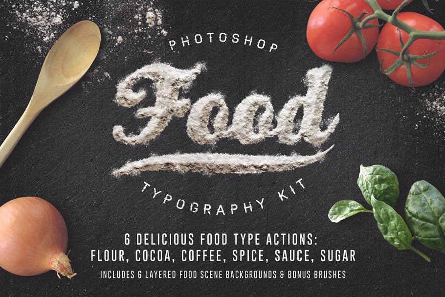
Have fun with the way you display letters and words sometimes, regular letters fail to get the point across; in this case, using ingredients makes perfect sense and adds an element of fun to the poster. Not only will you be left with a unique design, but you ll tell the viewer more about your message.
5. Contrast Stark Typography With Design Elements
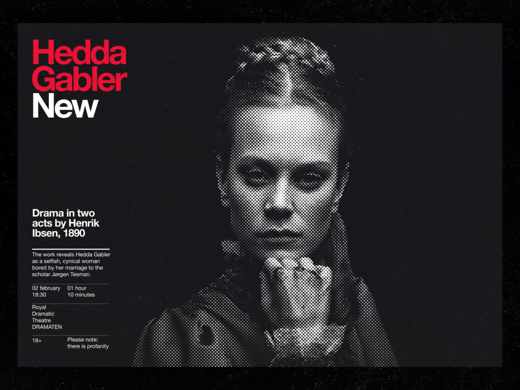
The lone pixelated image of a woman against a black background adds a stark contrast between the text on the poster. However, the minimal design elements of the graphics and flat background with the color combination draw your eye directly to the text.
6. Don t Be Afraid to Layer
Layering might seem counterintuitive like it will lead to an overall busy effect. However, when done correctly, layering typography on top of another element can make it even more striking. Because of the transparent nature of each element, they aren t competing with one another for space, but rather they re complementing each other to make a stronger design.
7. Match Typography to Your Theme
This poster is a perfect example of keeping typography in harmony with the theme of the event. The letters evoke the feeling of bluegrass, which is a simple but powerful strategy. If you can find text that absolutely nails the overall feel of your advertising use it, and let it speak for itself.
8. Use Clever Tricks

For this election poster, the V on the word vote also represents an old-school ballot where a voter marked a box with a check. Even straightforward, simple design elements, will make your poster stand out from the dozens of others out there.
9. Combine Lettering with Photos
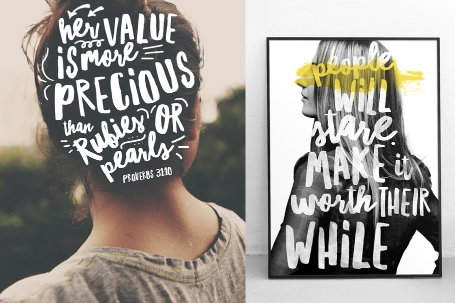
Script and photographs can create a powerful image, with only two elements. For this example, the hand-drawn typography is meaningfully placed on the back of the head to symbolize that it's on the person s mind. In the second example, the lettering is perfectly encapsulated in the silhouette of a female figure, which is just as clear and impactful. Typography filling in the shape of a photograph forms a meaningful visual.
10. Know that Perfection is Overrated
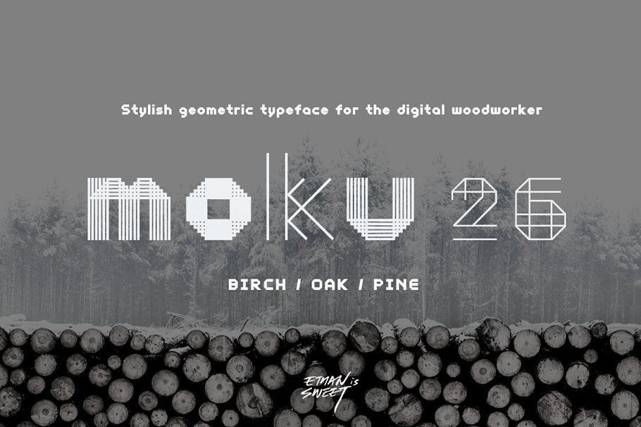
This geometric design achieves a perfectly imperfect appeal. You might think that this type of variance would be jarring to the eye, but somehow it s not busy, and instead, makes the message more obvious without being overbearing. Typography doesn t have to be perfect to be distinctive.
Use Creative Poster Typography to Stand Out
Posters have a limited amount of time to catch the eye of someone walking past. Use dynamic typography in your poster design to capture a viewer s eye and make your marketing pop. Design your poster with MyCreativeShop today!