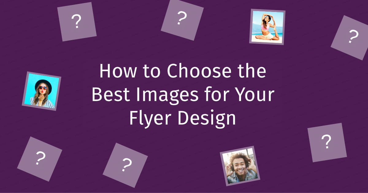
How to Choose the Best Images for Your Flyer Design

Printed flyers remain a key marketing tool for local and small businesses and your flyer design determines whether it's effective or not. Walk through any city or town center and you ll see walls, lamp posts, and business windows plastered with various advertisements many of which will blend into the background as you pass by.
That's why you need to make sure your message pops with images. It's been said that the human brain can process images 60,000 times faster than plain text, making them critical for an effective flyer design.
Use these five best practices to choose the most effective photos for your flyer design and make your message stand out.
Know the Difference Between DPI and PPI
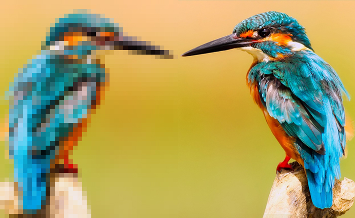
How many times have you selected an image that looks great on your computer, looks pixelated or blurry when printed? This problem is solved by selecting high-quality images that are sized correctly.
According to Adoroma Learning Center, you need to select images that are at least 180 pixels per inch (PPI). However, for the best quality, you want to go all the way to 300 PPI. For an image to be a printed physical size of 8 x 10 , this means your image pixel dimensions should be at least 2400x3000. Selecting an image with more pixels will ensure your graphics are sharper and do not blur when printing. Note, however, that printed image resolution is expressed as DPI, not PPI.
DPI stands for dots per inch, which represents the total number of dots of ink per linear inch of printed material. This is also known as printer resolution. DPI can also be used in reference to dots of ink per square inch of your printed image, referred to as printed image resolution. Dive into DPI versus PPI in our blog post.
Check our blog post, A Complete Guide to Understand DPI, as well, if you want to learn how to calculate the DPI of an image to make sure the final image is as high quality on paper as it is on your screen.
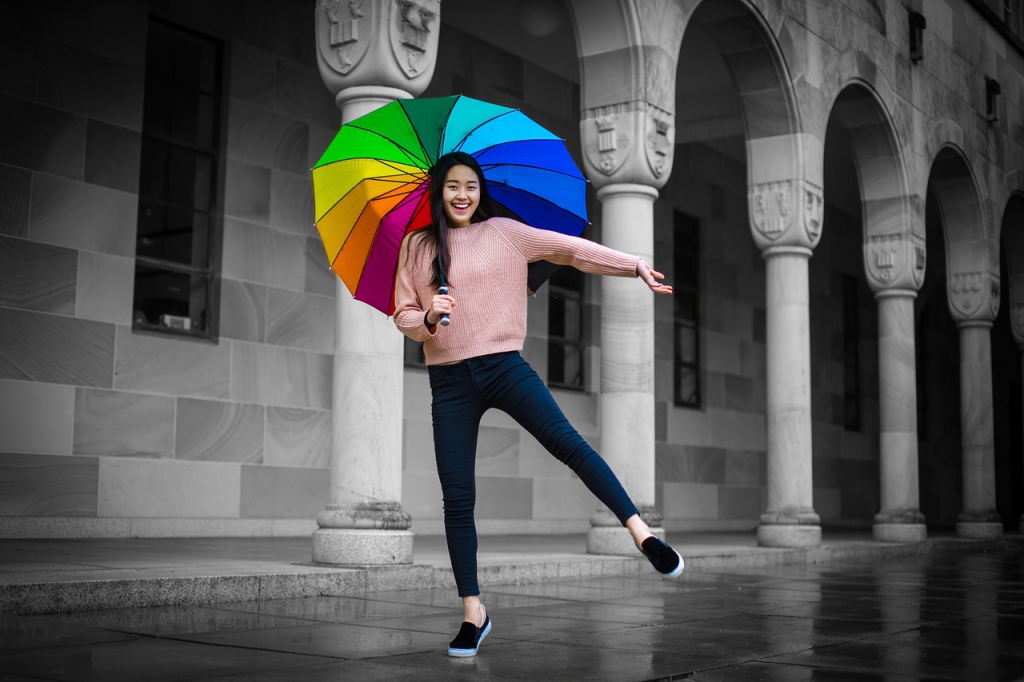
Pick Images That Trigger an Emotional Response
There s a reason people gravitate toward cute cat videos on YouTube or smile when they see pictures of puppies on Facebook. Certain images elicit an emotional response and are better at catching our attention. Shutterstock compiled a list of image types that psychologically draw us in, which includes:
- Portraits: Eye contact creates a connection between the viewer and the image and taps into our desire to communicate and have social relationships.
- Babies: Shutterstock sums it up best, saying, When we are presented with these cute characteristics, the nucleus accumbens is activated, and a huge surge of the pleasure hormone dopamine is released leaving us feeling happier and completely enthralled by these tiny creatures.
- Inspiration: Inspiring images provide a feeling of motivation and empowerment. Think about the imagery from companies like Nike or Apple and how impactful they are.
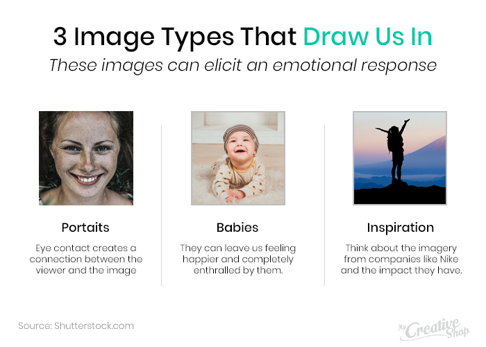
Despite the emotional response, always choose images that are in line with your brand and messaging. A picture of a kitten may elicit an emotional response, but it likely wouldn t be appropriate for a nail boutique.
Note: This section doesn't dive into some of the licensing & best practices that you should consider when you choose your images. If you're interested in learning more about that. Check out this great resource from Stock Photo Secrets. --> Ultimate Guide to Rules for Using Stock Photos
Use the Right Colors
Certain colors also evoke a strong sense of emotion and influence decision-making when used in flyers and printed advertisements. In fact, research shows that 62 to 90 percent of snap judgements are based on color alone.
Control the mental and emotional reaction of your audience by simply using a little color psychology that coincides with your message. For example, the color yellow is often associated with warmth and happiness. Blue symbolizes calmness and wisdom, but may also be viewed as uncaring and cold. Green is often associated with money, wealth, and growth.
Don t simply choose random colors based on their emotional responses. Above all else, it s important to choose colors that are familiar to your audience and related to the look and feel most closely related to your brand.
Use the Rule of Thirds When Choosing Images
If you're a photographer, then odds you're familiar with the
Rule of Thirds. For anyone who hasn't heard of it, the Rule of Thirds is a basic photography principle that was created to help photographers take well balanced and interesting images.
Why should you care? When considering what photos to use in your flyer, a Rule of Thirds image can naturally create places for you to include important text alongside an amazing image. Images that disobey this rule can leave you struggling to find places to include important text.
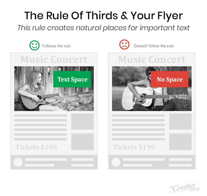
This technique keeps your flyer from becoming overcrowded while ensuring that your image placement has the greatest impact.
Boost Your Flyer Design With Images
Draw more attention with your next flyer with the right images. Paired with a clear message and eye-catching design, you can improve response rate and stand out on the local crowded coffee shop advertising board.