10 Different Font Types and How to Choose Yours


Selecting fonts might seem like one of the easiest tasks of designing. However, the text on a brochure or business card can make or break the success of the overall design.
That s because fonts have the power to influence your overall perception of text. For example, a recent study gave pregnant women a sheet of paper detailing the same at-home exercises, but with different fonts. The pregnant women who had the instructions with harder-to-read fonts felt like the activities were more difficult to complete.
Fonts also tap into your semantic memory. Certain fonts are ingrained in your mind as being associated with something. When you see that font, you think of that thing. For example, Helvetica is a font used on U.S. government tax forms, but also in the New York City transportation system (i.e. all NYC subway signs).
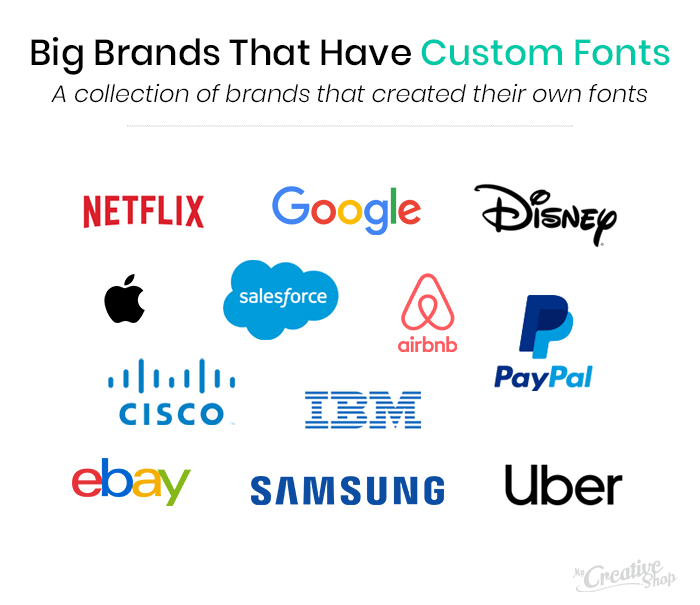
This is why large brands often create their own font. A common example, is the eponymous Disney font, Waltograph. Netflix also recently created its own font to further differentiate its branding.
Traditionally, there are four main categories of fonts:
- Serif: Small embellishments at the end of each letter.
- Sans Serif: The word sans is means without as such, sans serif is a serif font with no embellishments, which creates a cleaner effect.
- Script: Mimics handwriting or cursive.
- Decorative: Any non-traditional font with an element of design or artwork.
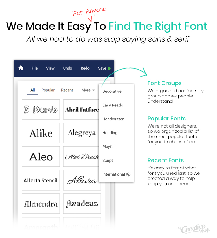
If you re feeling a little lost, you re not alone. We noticed that MyCreativeShop users were having a hard time finding the right font, so we decided to build a font list that s clearly organized and easy to use. We use group labels to make sense of these categories and the various font types, so designing is even easier for you.
If you re ready to explore some fonts before designing, check out the following font examples and consider how they can work in your business s designs.
Also check out: 10 Creative Poster Typography Examples
1. Cabin

Use Cabin for paragraph copy on a flyer or brochure because it s easy to read in large blocks of text thanks to the clean finish.
2. Permanent Marker

This font evokes writing with a thick-tipped Sharpie. It s eye-catching and works well for a bold title or header. Think of a fashion or beauty blog. Pair Permanent Marker with a minimalistic sans serif font, like Rambla.
3. Raleway

This is a header or title font. It s modern and crisp design is popular with graphic designers. Raleway as a header works well with Roboto as your main copy font.
4. Merriweather
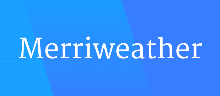
Merriweather is a classic, trendy, and simplistic serif font that works especially well onscreen. If you're designing any graphics for social media or website, consider using it. In particular, the all-caps format stands out to make an impact.
5. Crushed

This font is unicase design (either all upper or all lower, not a combination of the two) and gives a modern and fresh feel to your design. While it reads well as copy text, it can also be used as the font for a single-word logo with graphic elements around it.
6. Courgette

While this italic-script font looks handwritten, it still comes across clean and concise. Courgette offers a lightness to any text, without being a hard-to-understand cursive or brush font. Use anywhere that you want a font with a balanced flow that stands out not recommended for body copy or long text.
7. Fascinate
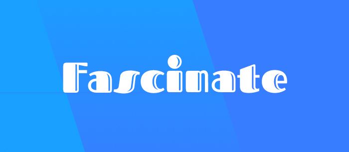
If you re looking for a font that creates a sense of nostalgia, use this one. Fascinate is a decorative font, specifically in the Art Deco style (similar to Broadway on the original Microsoft word programs). This font works well if you re marketing a flashback or historical-type event - think a Great Gatsby party.
8. Desyrel

Another brushy, hand-drawn font, Desyrel looks slightly more unique, as if an eccentric, creative person with quirky handwriting quickly sketched it. If you want a bold CTA or proclamation, Desyrel is a winner. As a companion subtext font, Exo contrasts well.
9. Archivo Narrow

This sans serif font is versatile. It reads well on screen and print, so can be used for headlines or main text. As the name applies, it s a narrow font, so if you re short on room (say on a business card), this is a good option you can fit in more text without it looking too cramped.
10. Lustria

Another multifaceted font, Lustria is a refined serif font that works well as body text. However, its subtle yet stylized serifs also create an elegant feel when used for headings and subheadings. Achieve a complete look by combining Lustria with Lato - the two fonts look similar, but their slight differences complement one another well.
Choose the Best Font Types for Your Design
Fonts elicit feelings. When creating your own marketing materials, think carefully about the tone you want to portray and how your fonts can bring that to your design. The right fonts will make for an effective and eye-catching design and reinforce your message.