Color Psychology for Print Marketing

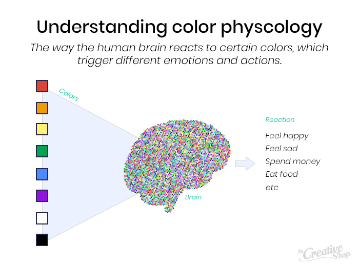
Color psychology refers to the way the human brain reacts to certain colors, which trigger different emotions and actions.
When used strategically, different colors can make your marketing materials more memorable and relevant, whether you re designing flyers or brochures.
As a small business owner, you don t need to understand complex concepts to leverage the power of color psychology. All you need is a basic understanding of how a particular color can trigger a certain mood or feeling and how to incorporate it into your print marketing materials.
Keep this guide closeby when designing print materials and let the power of color psychology rock your print marketing efforts.
Don t forget: 8 Ideas for Tracking Print Marketing Success
The Basic Color Psychology Breakdown
Color is just one component that affects how potential customer react to your marketing materials do they throw your postcard in the trash or hang it on the fridge to use later? Knowing which colors convey which feelings will help you create print materials that encourage customers to take the intended action.
Use this breakdown of color psychology as we discuss the many ways you can use colors to design better print materials.
Red: Associated with hot, fire, blood, passion and excitement. It s also closely associated with Christmas.
Related colors: Burgundy, magenta, maroon.
Orange: Associated with feeling lively, energetic, warm and exuberant. It s also closely associated with autumn.
Related colors: Peach, tangerine, salmon
Yellow: Associated with sunshine, caution, inspiration and feeling cheerful.
Related colors: Gold, lemon, canary
Green: Associated with nature, and feeling cool, refreshing, peaceful. It s also closely associated with St. Patrick s Day.
Related colors: Emerald, chartreuse, teal
Blue: Associated with sky, water, ice, and service. You ll notice many major brands use blue in their logo, including Twitter, Facebook, IBM and a 2017 worldwide survey found that the world s favorite color was green-blue.
Related colors: Cyan, navy blue, cerulean
Purple: Seen as dignified, mystic, but can also represent loneliness and mourning.
Related colors: Lilac, eggplant, plum
White: Associated with cleanliness, purity, and brightness. It s also closely associated with winter and snow.
Related colors: Cream, ivory, eggshell
Black: Associated with night, death, mourning, emptiness and darkness. Related colors: Midnight blue, charcoal, taupe
In this article we're breaking down color psychology and if you like what you're reading we think you should also check out color theory, which is the art and science of how colors interact with other colors to acheive different effects. This guide to color theory is one of the best we've found.
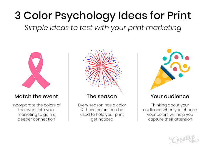
How to Use These Colors
Now that you have an idea of what associations consumers have with each color many of which you may have already assumed, having experienced them yourself it s time to put this color psychology into action. Here are a few ways to make your print materials stand out and drive potential customers to take an action.
Before changing all your marketing materials, remember to always keep your brand color palette in mind. If you ve chosen one to two neutral colors as your brand base, you can then use color psychology to decide which colors will best compliment your brand while having the desired effect.
Match Your Colors With the Feeling and Intention of the Event
When attending trade shows, conferences or even local community events, consider how you can use colors to match the feeling you want to convey and the overall theme of the event.
For example, your signage and brochures at a breast cancer walk may incorporate some pink (the color most often associated with breast cancer) along with yellow or orange, to denote cheerfulness, liveliness and joy, matching with the overall theme of the event. When potential customers return to these materials, they ll associate your brand with an event they loved.
At a business conference, you may want to convey a more professional, trustworthy brand feeling to drive leads. To do so, you could use pops of blue, which is one of the most liked colors around the world and is often associated with business.
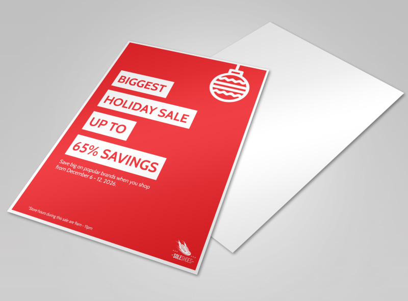
Conversely, for a clearance or sales event, reds can be used to convey urgency. The color red is often used for this type of event, and that familiarity can also make your materials stand out and have a greater impact.
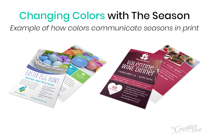
Keep the Seasons in Mind
The mindset, experiences and desires of consumers change with the seasons. To stay relevant and stand out, the colors in your print marketing designs should change too. Not only should you consider holidays, like Christmas, Fourth of July, and the like but the season itself.
For example, pops of bright yellow and pink can make your summer marketing materials stand out while blue and white can be used more often in the winter, and orange and browns in autumn. If you want customers to take action, your materials must match their mindset, and color allows you to do that.
While this may seem obvious, it can be challenging to execute how do you pair your brand colors with these colors if they don t go well together? Here are a few tips:
- Rely on white as a base color: If you want to incorporate a variety of colors, white is a neutral background that can stabilize the design.
- Focus on complementary colors: A complementary color pair uses one primary color, like yellow, blue or red and and one secondary color, like green, purple or orange. The idea being: these two colors are directly opposite of each other. These opposing colors create maximum contrast and maximum stability, explain experts at Color Matters.
- Find a color palette: Use a tool like the one offered by Coolors.co to find the best combination of colors for your print design. This way you don t have to guess about what looks best.
Get more ideas: The Marketing Materials Every Business Needs Year Round
Choose Colors That Attract Your Intended Audience
Your audience directly impacts the design of your print materials if you want them to take action, you need to use colors that attract them to the messaging. For example, a restaurant would choose different colors for their singles night flyer versus their family night flyer.
For singles night, you may play with variations of red, which indicates passion and love. For family night, blue, yellow and greens may be better to portray trust, fun, and liveliness.
It you re short on time, and don t want to spend it coming up with new designs for each event, here are two options:
- Create a template that can be updated with new colors as needed. Simply change the text and imagery where necessary.
- Use MyCreativeShop templates to quickly and easily find and customize a design for your intended audience.
Use Color Psychology to Your Benefit
Color psychology can make or break your print marketing materials. When your flyer s hanging with dozens of others, or your brochure is tossed into a conference swag bag with hundreds of others, the right colors help you stand out. Use these basic guidelines and ideas to make sure you get the most out of every print material you design.